Skip to content

Premium fashion

Hexeline – e-commerce design for a premium fashion brand

A completely new online store for Poland's premium womenswear brand Hexeline: from a revised brand book to every single view, checkout included. A year of design work, a Shopware build by a partner and roughly 20% online sales growth within a year.

Jerzy Koenigshaus

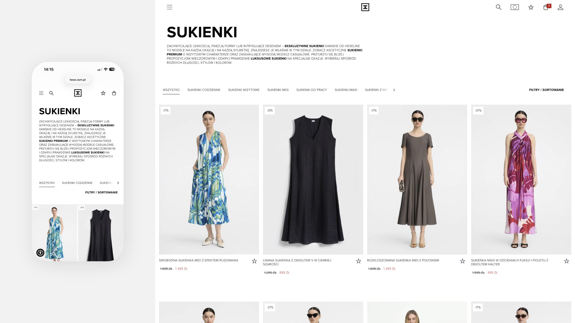
Hexeline's new online store – product list and the mobile homepage

Context

Website from another era

Hexeline has designed and made premium womenswear for over 40 years and sells it in stores across 20 Polish cities. The online store worked and sold, but it lagged behind the product: it presented the collections poorly and didn't build the trust the brand had earned since the 1980s.

Instead of a facelift we proposed a complete change: a new digital identity and a store designed from scratch, view by view.
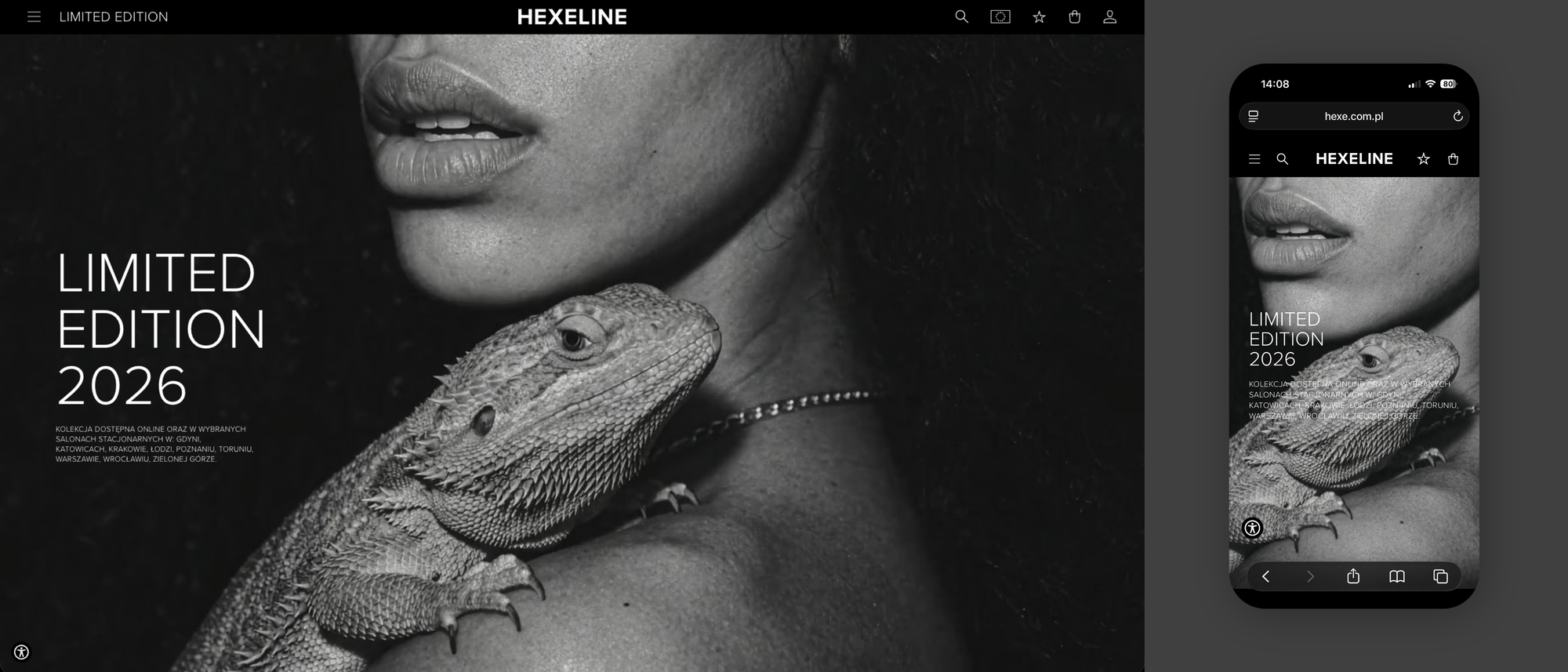
Hexeline homepage – desktop and mobile
Homepage – desktop and mobile.

Challenge

The aesthetics of a lookbook, the duties of a store

Premium fashion is the least forgiving digital discipline. Photography, typography and space have to work together like a well-composed lookbook, or the product loses its class. At the same time the store has to sell: show size availability, guide the order, handle returns and shipping at home and abroad.

The brand book was our starting point. In the course of the project we revised it almost entirely, because only on screen can you see which assumptions hold up. What stayed was the essence: black, white and the product up front.

Hexeline product list – desktop and mobile
Product list – desktop and mobile.

Design decisions

Black, white, high contrast and no decoration

The new visual language is bold, but it serves one rule: the product plays the lead, not the interface. High-contrast black and white sets the stage, typography never competes with the photograph, and every module from hero to footer sits on a grid that carries a brand campaign as well as a sale.

The design took close to a year. There were plenty of variables: collections change every season, modules have to work in many configurations, and a custom design means no ready-made template to lean on. So we refined every element separately, checkout included.

The homepage holds video, full lookbooks and product lists where films play next to the photographs. The product page shows available sizes at a glance, and size guides help customers get the fit right the first time.

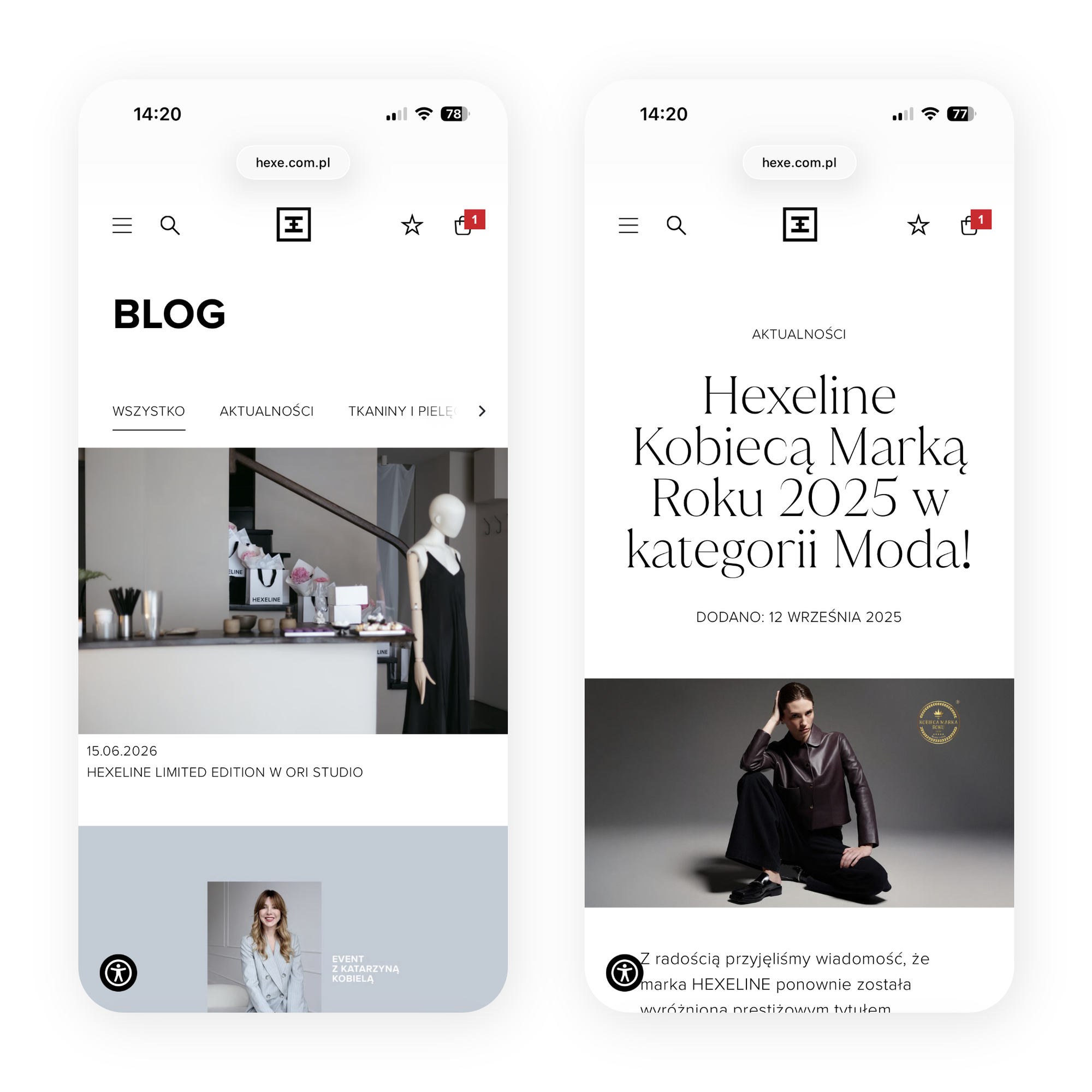
Hexeline blog and news on mobile
Blog and news.
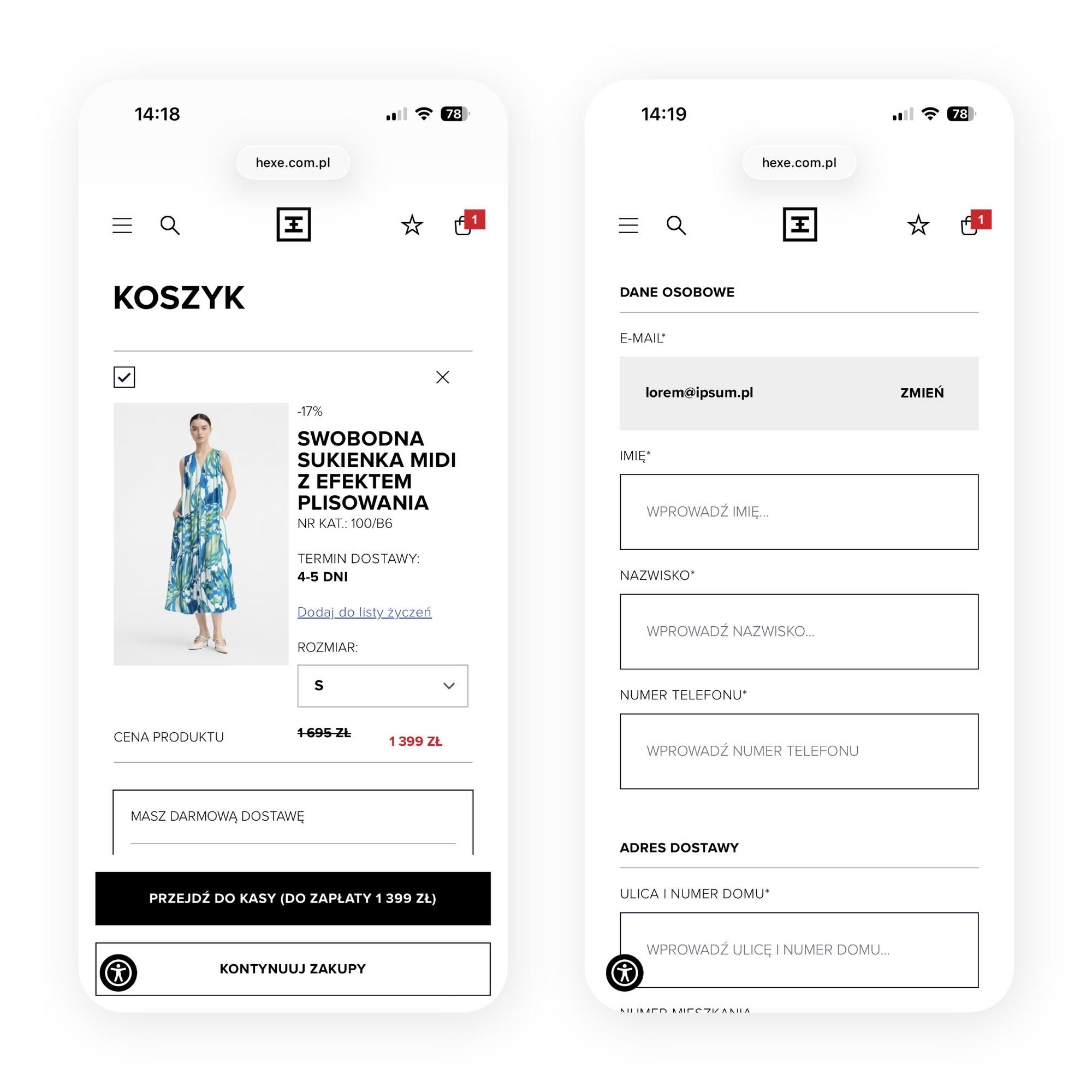
Hexeline cart and checkout on mobile
Cart and order details.

Behind the storefront

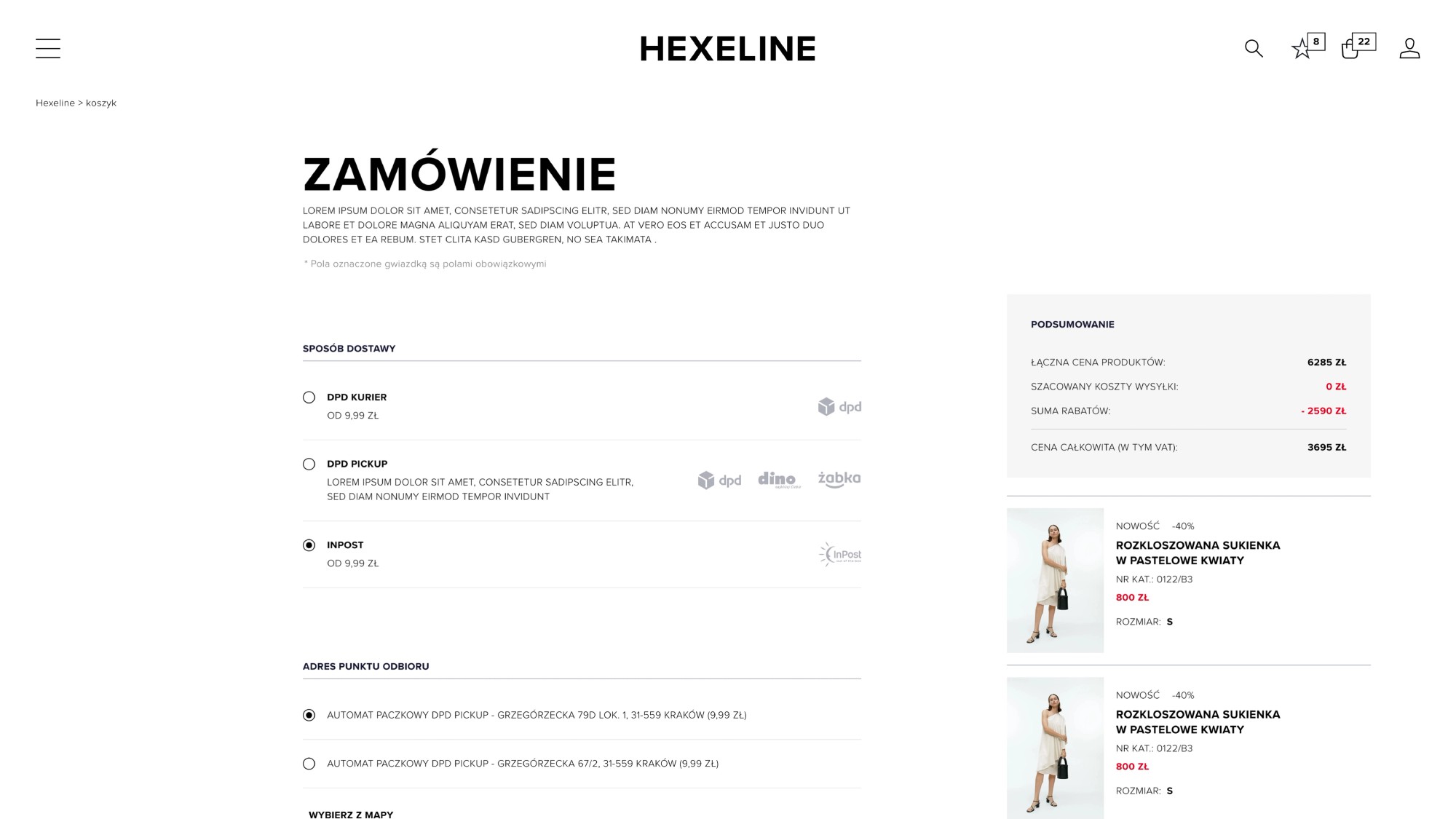
Checkout and logistics, step by step

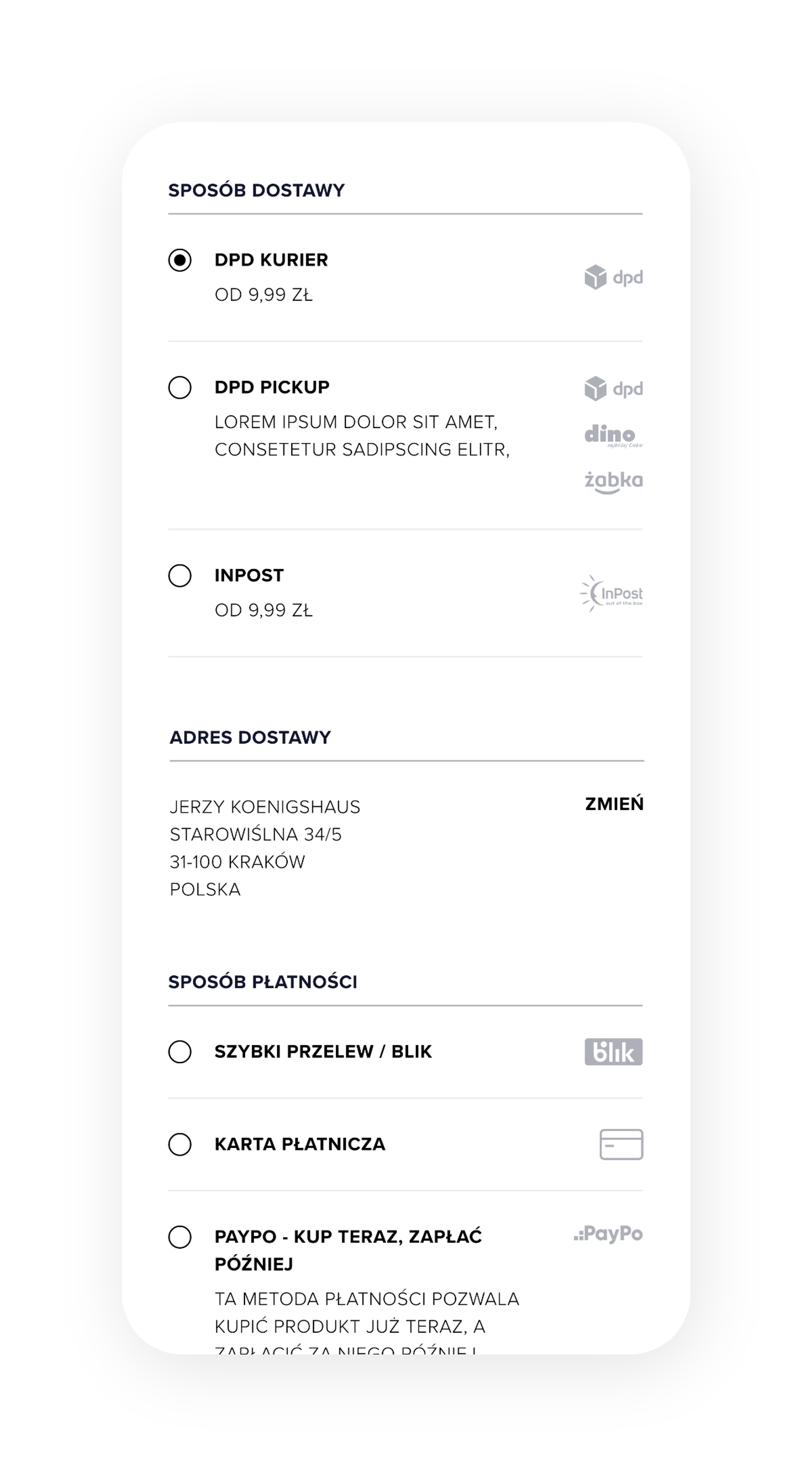
Premium sales most often break down at the end of the path, so we designed the checkout screen by screen. We mapped the full order structure: the returns policy, delivery options and shipping within Poland and abroad. It's the least glamorous part of the project, yet it decides whether a customer comes back for the next collection.

Loyalty programme in the Hexeline customer panel
Loyalty programme and customer card.
Returns in the Hexeline customer panel
Returns and shipping options.

Collaboration

Design by us, the Shopware build by a partner

Jerzy Koenigshaus was responsible for the design, while the Virtua team built the store on Shopware. That split demands discipline: mock-ups have to be complete, states described, layout rules unambiguous. Thanks to that, nothing got lost between design and code.

We planned the category and content structure with SEO in mind, because a fashion store lives off organic traffic as much as campaigns.

Delivery and payment in the Hexeline mobile checkout
Delivery and payment.
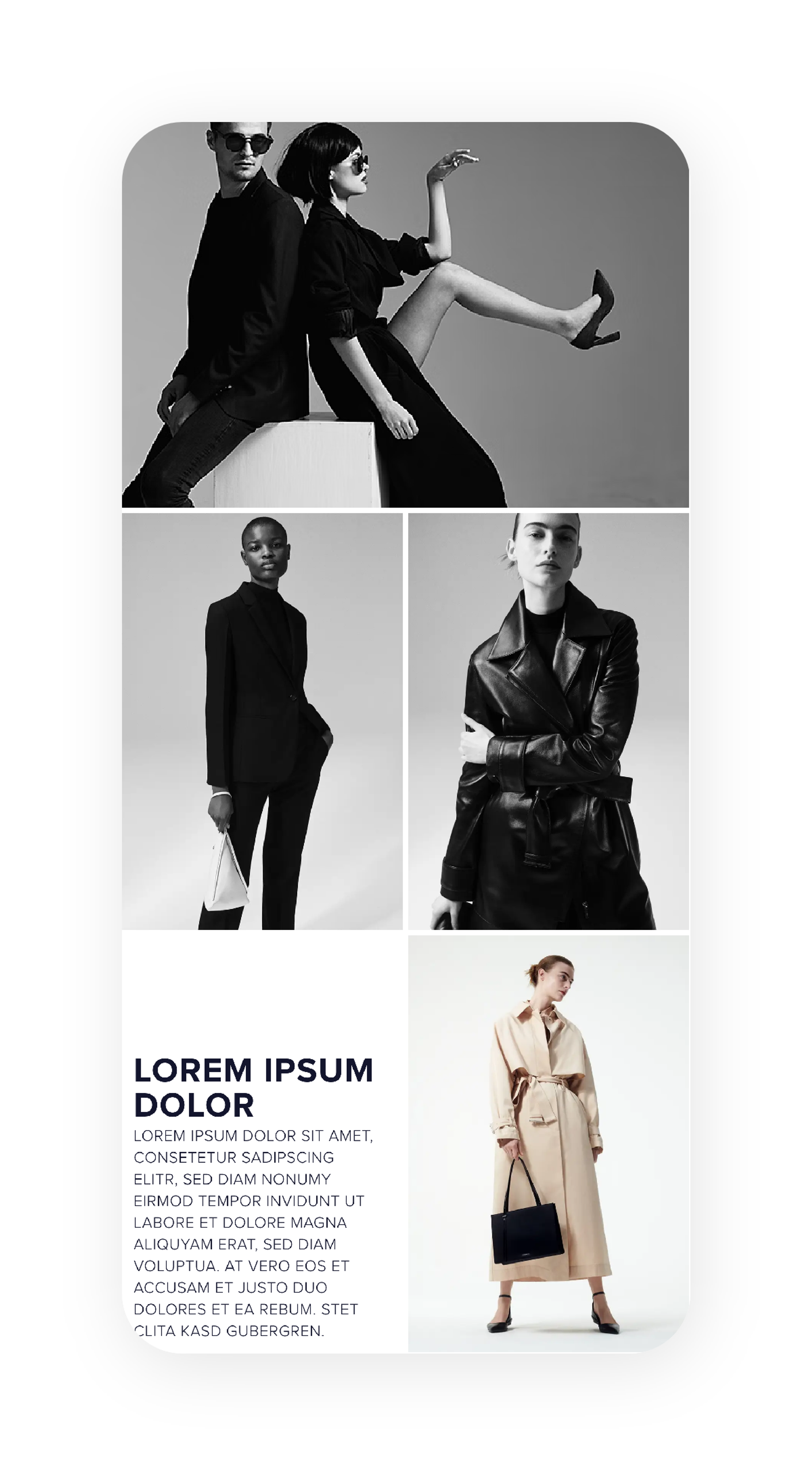
Hexeline lookbook modules on mobile
Lookbook modules.
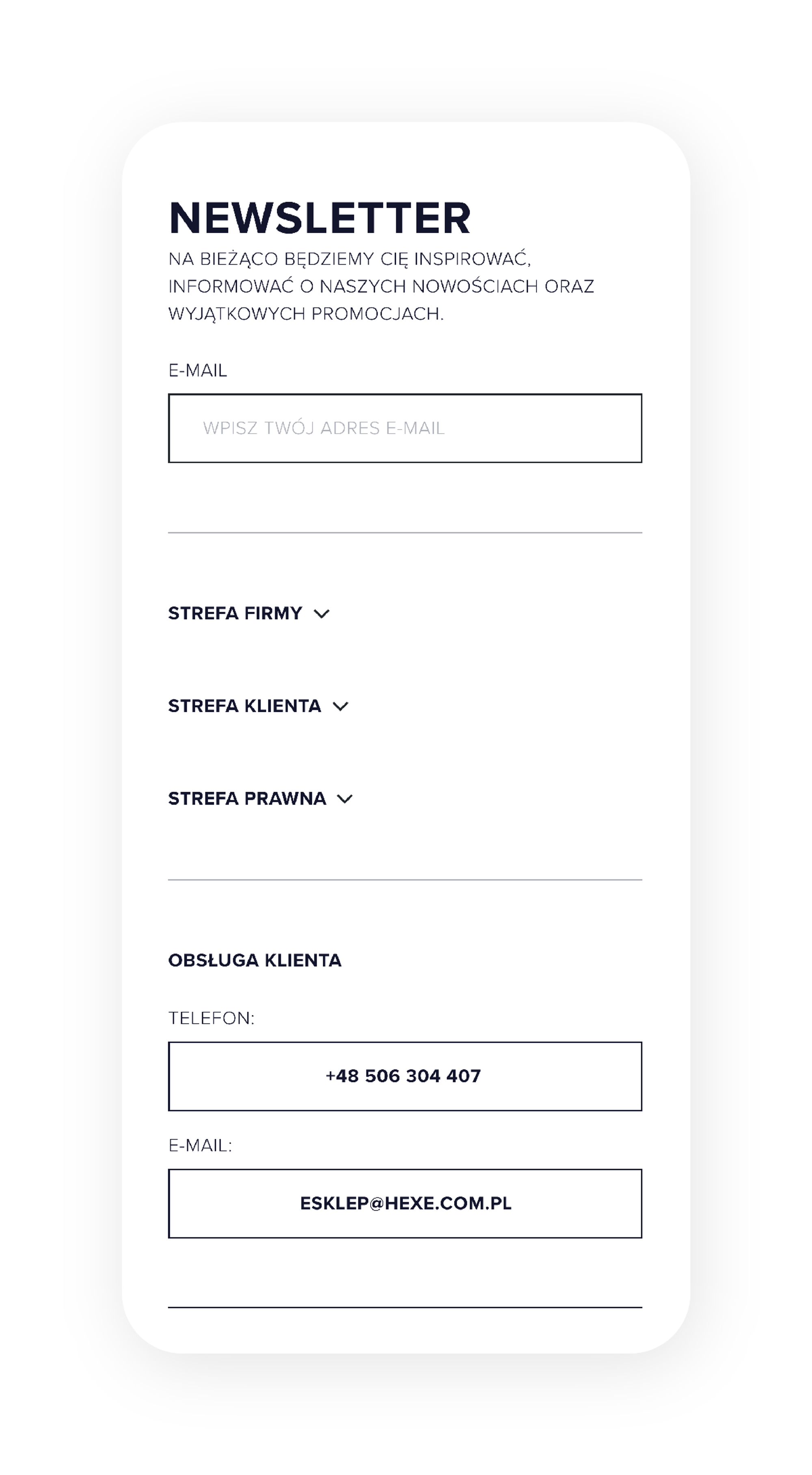
Hexeline newsletter and footer on mobile
Newsletter and footer.

Result

A store that sells better and looks like the brand

According to the client, online sales grew by roughly 20% within a year. The image matters just as much: online, Hexeline now presents its product with the class its boutiques are known for. The project is still going: every season we design new modules, and they fit into the base refined during that first year.

By the numbers

~20%
online sales growth year on year
1 year
of refining a custom design
20
cities with Hexeline stores
40+
years of brand history

Related services

Related projects

The Novacura rebrand – identity and UI components

B2B technology

Novacura – a rebrand and a UI component library

A brand refresh for a Swedish technology company. A light logo correction, an entirely new colour palette with blue in the lead, a linear-wave key visual and a UI/UX component library, still being rolled out across Novacura's products.

Blog

Related articles

Have an idea in mind? Let's talk.

Tell us about your idea and we'll recommend the best route from concept to a working product.

Get in touch