Skip to content

B2B technology

Novacura – a rebrand and a UI component library

A brand refresh for a Swedish technology company. A light logo correction, an entirely new colour palette with blue in the lead, a linear-wave key visual and a UI/UX component library, still being rolled out across Novacura's products.

Jerzy Koenigshaus

The Novacura rebrand – identity and UI components

Context

A brand that runs from a business card to a warehouse scanner

Novacura is a Swedish technology company from Gothenburg, present in 10 countries and serving over 220 customers. Its low-code platform, Novacura Flow, extends ERP systems such as IFS and Infor M3 with applications for the office and the warehouse floor.

The brand had a recognisable logo and its own colours, but no consistent rules. So the scope covered a light correction of the mark, a new palette with a key visual, and a UI/UX component library that carries the identity into the product interfaces.

The linear wave: the Novacura key visual

Identity

Blue as the brand carrier

The wave above is the brand's key visual: a linear picture of the information flows that Novacura Flow runs between an ERP system and its applications. The drawing scales well, so it works on a presentation cover and in an app header alike.

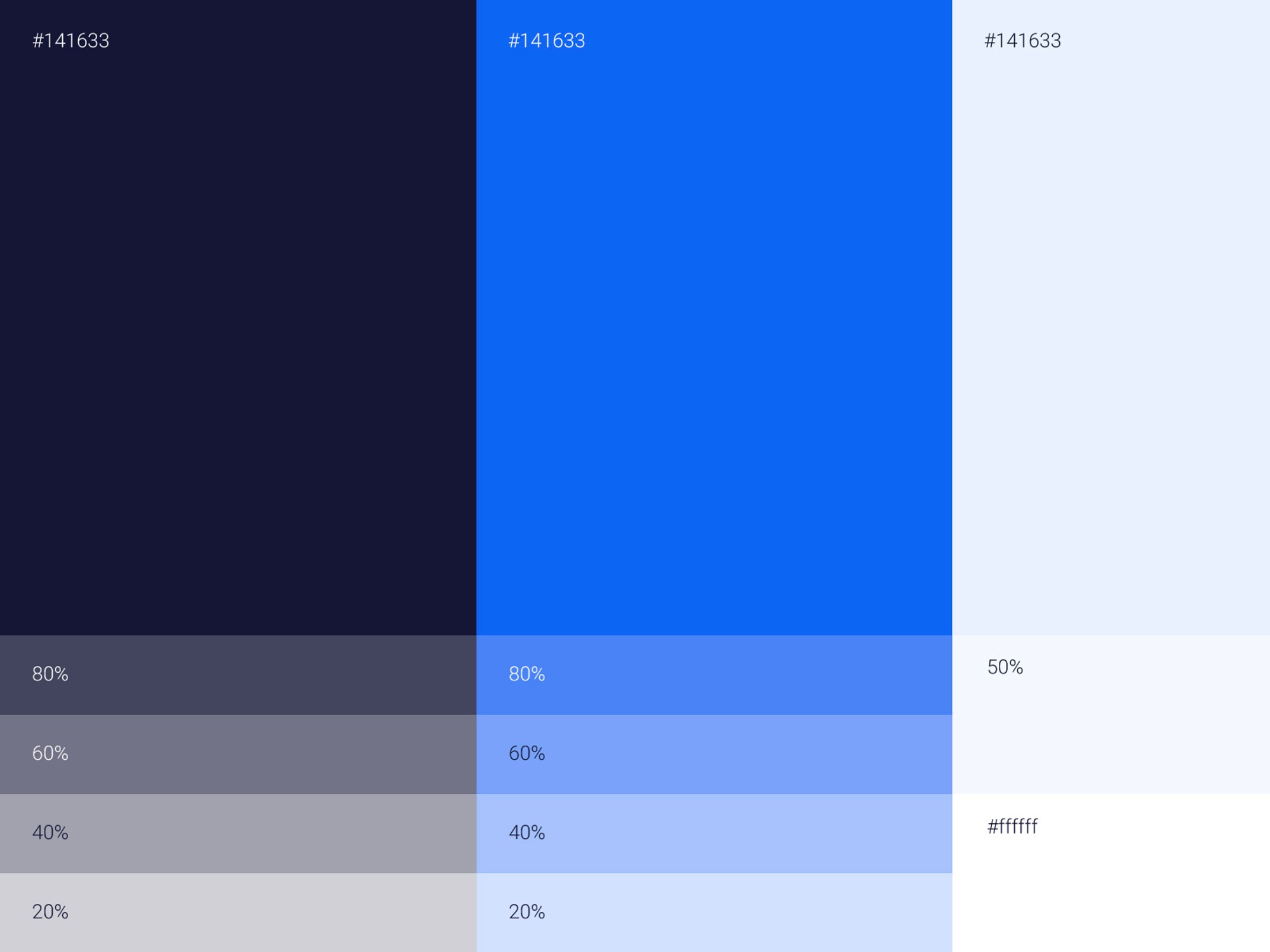
We based the new palette on a deep navy and a vivid blue, extended with a scale of tints. We corrected the logo carefully: the forms were refined and the character customers already knew stayed intact. A separate product mark followed, built on the same principles.

The Novacura logo on a navy background
The company logo after a light correction of forms.
The Novacura colour palette: navy, blue and a scale of tints
The new palette: navy and blue with a scale of tints.

Design system

Fighting for every pixel on a scanner screen

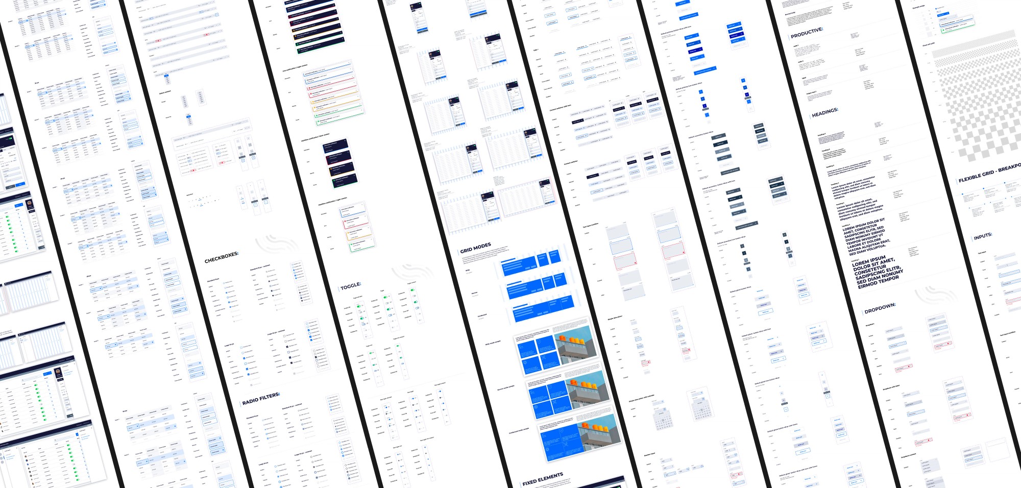
Novacura's applications run, among other places, on industrial Zebra scanners with small, dim screens. The UI/UX component library had to reconcile the brand language with the limits of that hardware: toggles, tables, pagination and tabs fit a full set of information and stay legible in warehouse lighting.

New versions of Novacura's products still use this library today.

Novacura design system boards: toggles, tables, pagination and filters
A slice of the library: toggles, tables, pagination and filters.

Before and after

The same screens, a new order

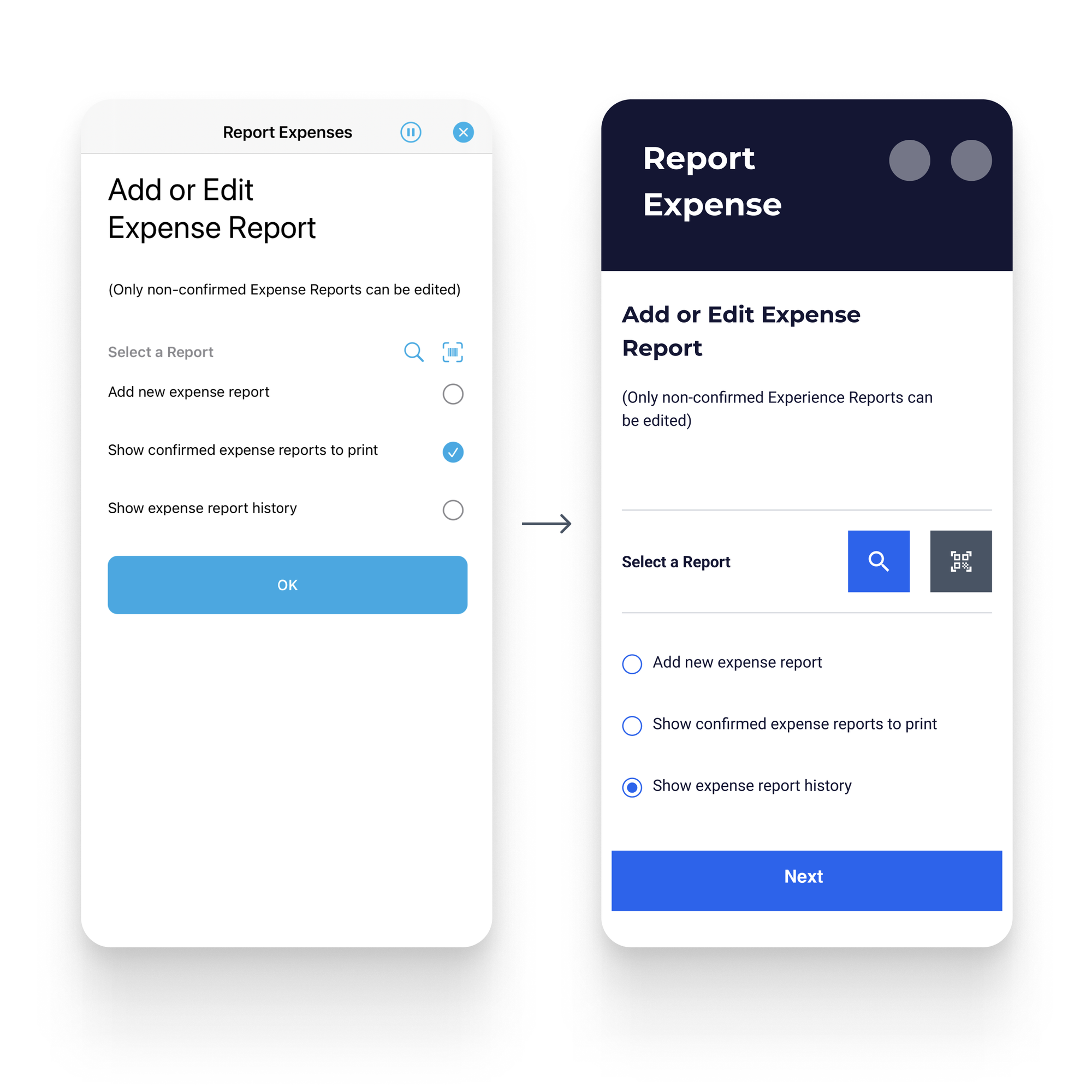
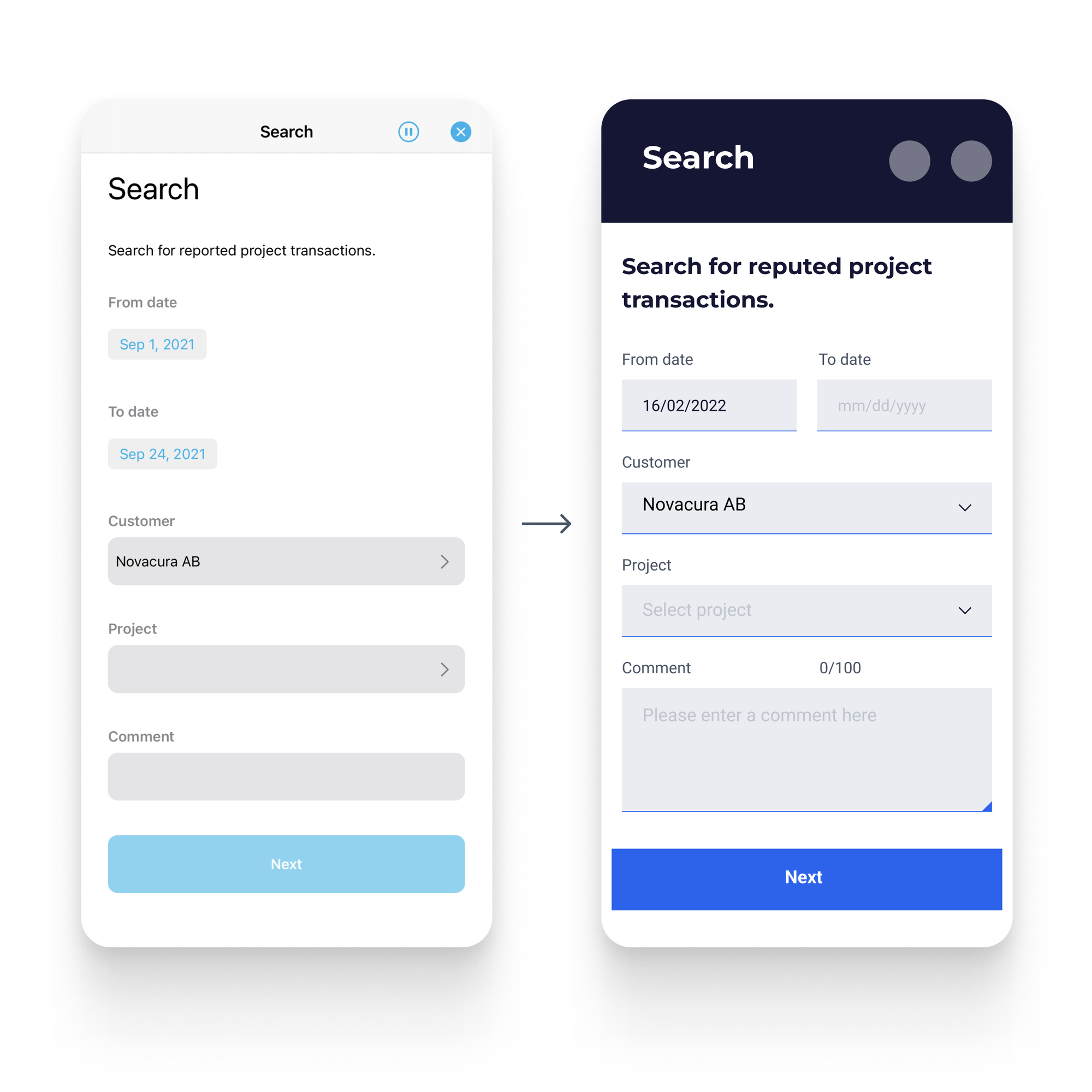
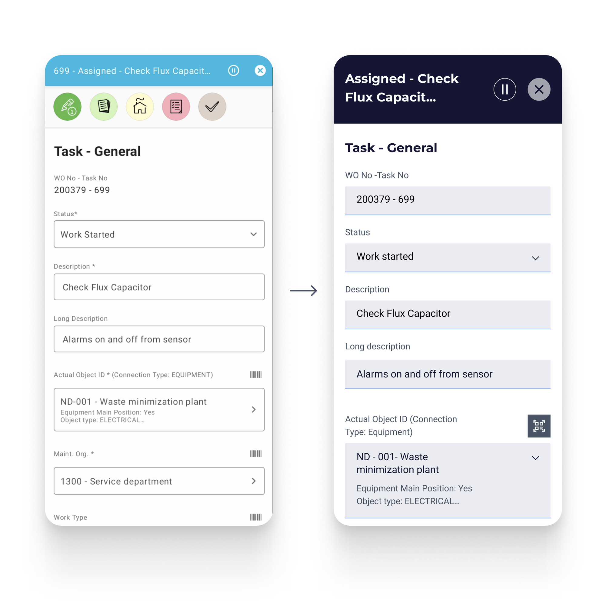
Below are three app screens: the earlier version on the left, the one built on the new components on the right. The layouts carry fewer decorations, a clearer hierarchy of content and stronger contrast, and the forms lead the eye from the header to the button.

Novacura Flow mobile screens before and after the redesign
App screens before and after the library rollout.
App screens before and after.

Result

An identity consistent with the product

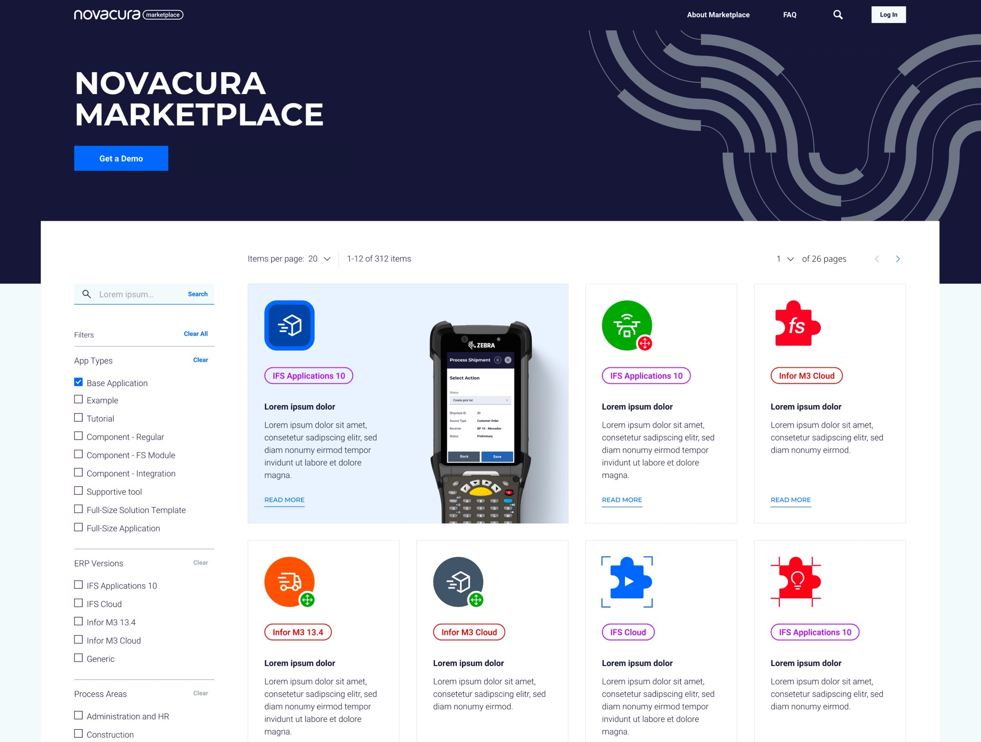
The scale of the change shows in Novacura's products and platforms. The app marketplace used to look like an average store; after the redesign it became a carrier of the brand in its own right, aimed at a specific audience: companies extending their ERP systems with ready-made applications.

Today Novacura has a brand that looks the same in a sales presentation, on the website and in an app on the warehouse floor.

The Novacura marketplace: the new page concept
Novacura's marketplace: the new page concept.

By the numbers

1+1
logo correction and a new product mark
10
countries Novacura operates in
220+
Novacura customers worldwide
1
UI library, still being rolled out

Related services

Related projects

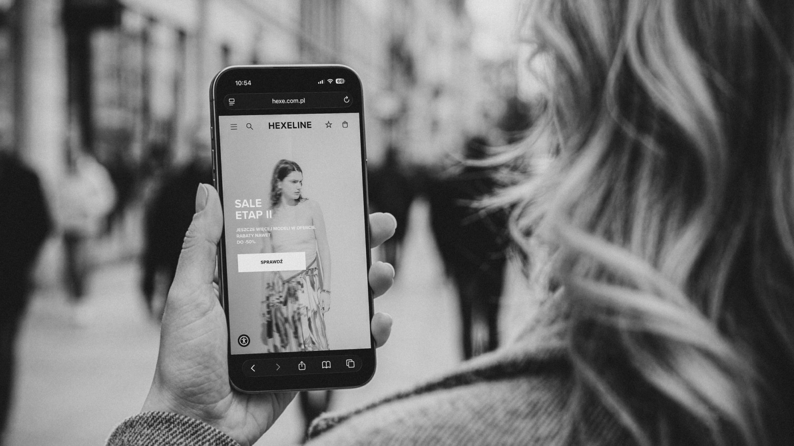
Hexeline's new online store – product list and the mobile homepage

Premium fashion

Hexeline – e-commerce design for a premium fashion brand

A completely new online store for Poland's premium womenswear brand Hexeline: from a revised brand book to every single view, checkout included. A year of design work, a Shopware build by a partner and roughly 20% online sales growth within a year.

Blog

Related articles

Branding & typography

Brand manual – what it is, what it contains and what it costs

A brand manual is the instruction manual for your logo – mark versions, clear space, colours, typography, examples of incorrect use. We explain what it should contain, how it differs from a brand book and what it costs.

Have an idea in mind? Let's talk.

Tell us about your idea and we'll recommend the best route from concept to a working product.

Get in touch