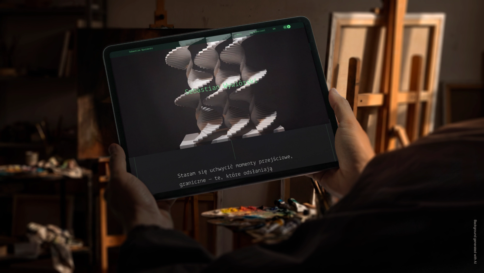
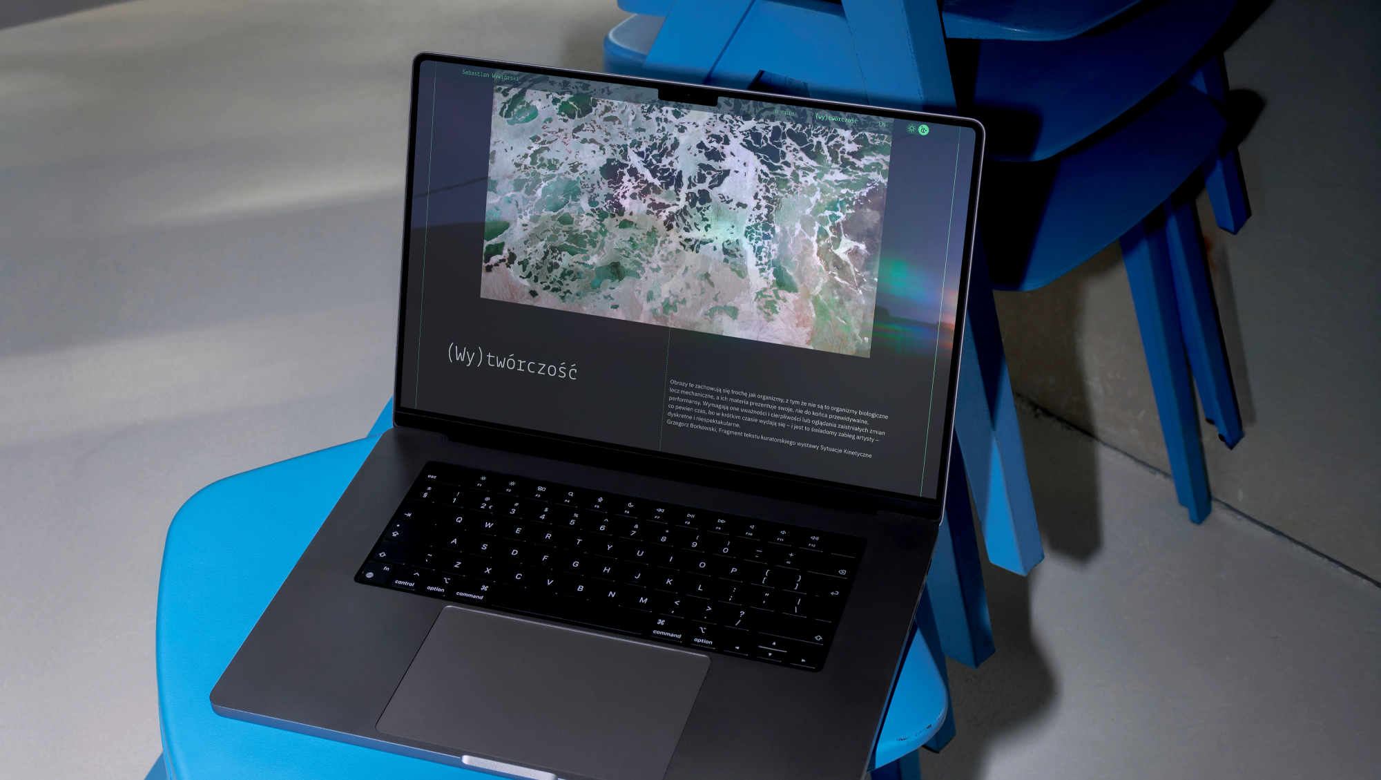
Building a portfolio website for Sebastian Wywiórski meant creating a digital environment for art that constantly escapes classical definitions. Wywiórski is an interdisciplinary artist who fluidly combines traditional easel painting with mechanical elements and kinetic objects. His broad visual practice also spans large-scale spatial installations, performance pieces and experimental video art. Designing a usable interface for such a versatile portfolio required a layout that keeps a strong character of its own, yet remains merely a backdrop that puts these diverse works on display.
Creative industries
Sebastian Wywiórski – design and build of an artist's portfolio website
How do you fit abstract art into a functional interface? See a website built on a universal grid.
Antonina Jasińska Piotr Sember Dr Katarzyna Cichecka
Context
The challenge
The core challenge in unconventional projects like this one is meeting the artist's very particular expectations. An artist usually has a highly developed aesthetic sense and will certainly not settle for a standard, conventional arrangement of visual content. Working for such a client almost always pushes us to keep searching, to break familiar patterns and to experiment graphically. At the same time we have to keep hard financial realities in mind. Budgets in the cultural sector are often tight, so every process becomes the difficult art of a wise compromise. Our overriding goal was to create a unique design that brings order to something that is, by its very nature, elusive and 'unorderable'.
Collaboration
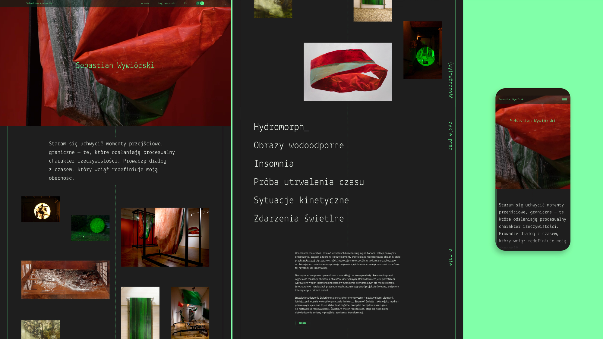
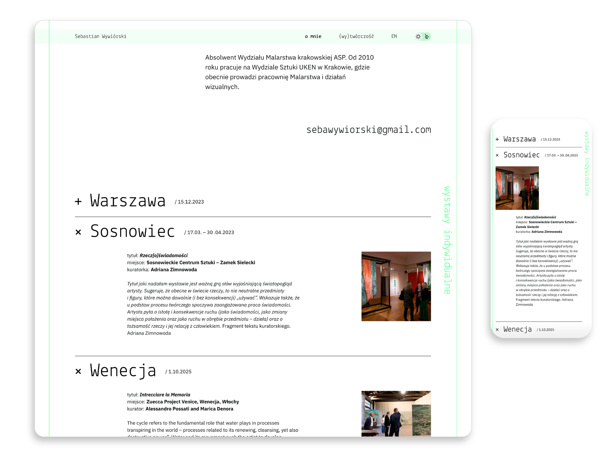
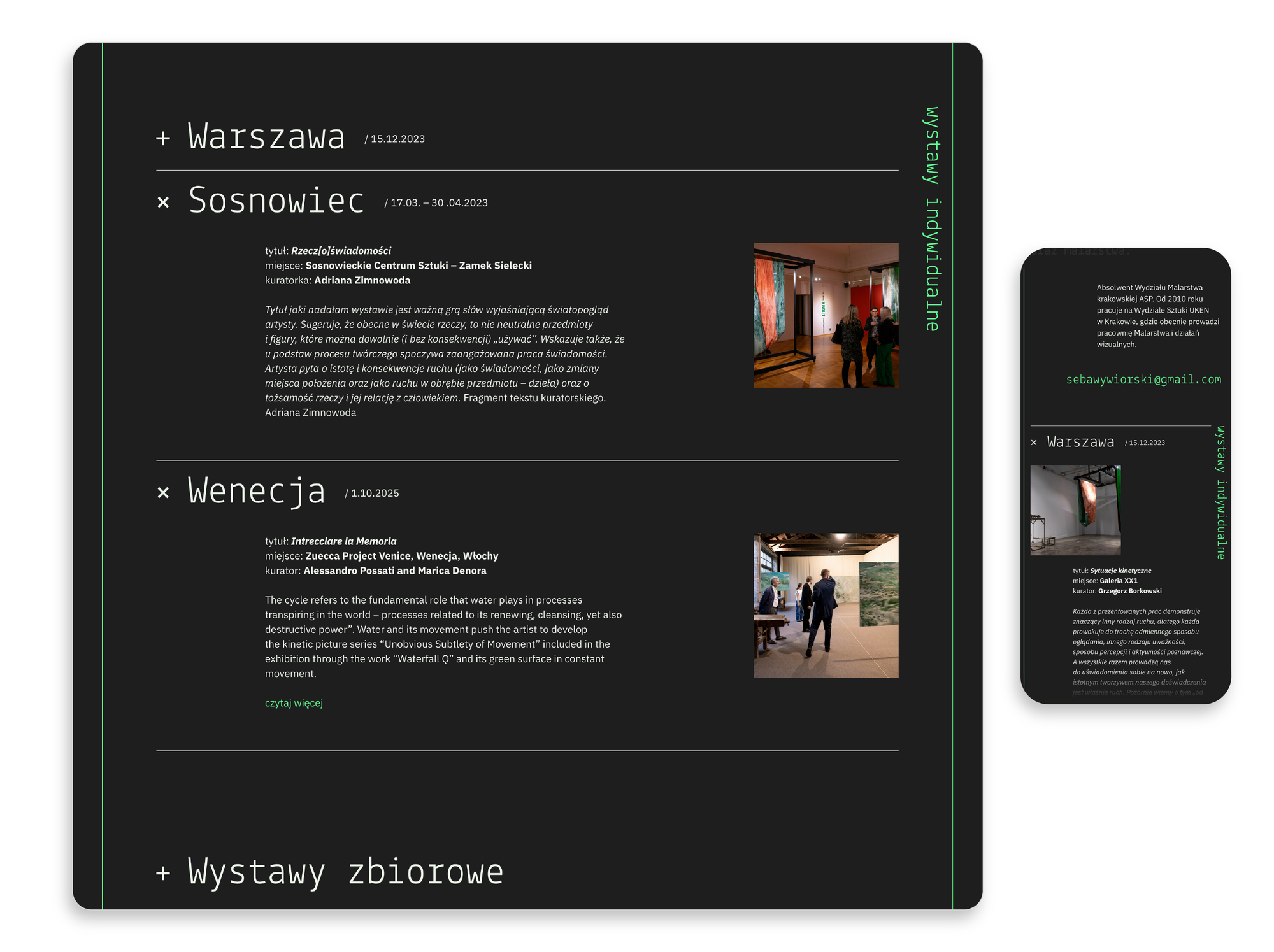
We often take on projects together with other experienced designers. This one was developed jointly with Dr Katarzyna Cichecka. It was her idea to bring bold, oversized typography into the layout. The large letters complement the clean photography beautifully, balancing right on the edge between filled space and graphic emptiness. In the course of shared analysis, carried out in constant dialogue with Sebastian Wywiórski, we reached an important conclusion: implementing dark and light modes would be a genuinely functional step.
The grid and CMS architecture
Technically, the whole site runs on WordPress, but the key task was programming the grid itself. Piotr Sember was responsible for this area and carefully worked out the logic of the CMS modules. He built an intuitive tool that lets new subpages be created freely while keeping full flexibility. Each time, the artist's works settle into a slightly different, asymmetrical composition. This intelligent grid was essential because Sebastian's video and photo materials came in a wide range of formats. Thanks to the precision of the build we didn't have to crop anything artificially – we stayed faithful to the source materials and kept order across all the portfolio subpages.
The result
Designing for demanding artists lets us test the flexibility and resilience of our technical solutions in practice. We created a fully scalable digital product that handles non-standard content proportions effortlessly while preserving the precision of the designed grid. Projects like this prove that we can sensitively frame even abstract visions within a usable interface. What's more, a well-designed, carefully considered layout can be implemented at a modest cost while keeping the website original, functional and easy to use.
Related services
Related projects
Culture
Sinfonietta Cracovia – a new logo and identity for an orchestra
A new mark for the Orchestra of the Royal Capital City of Krakow: a baton cutting through a circle, a brand book and signage for the orchestra's home. Since 2019 this system has held together 50+ projects we've designed for the ensemble.
Services / Architecture
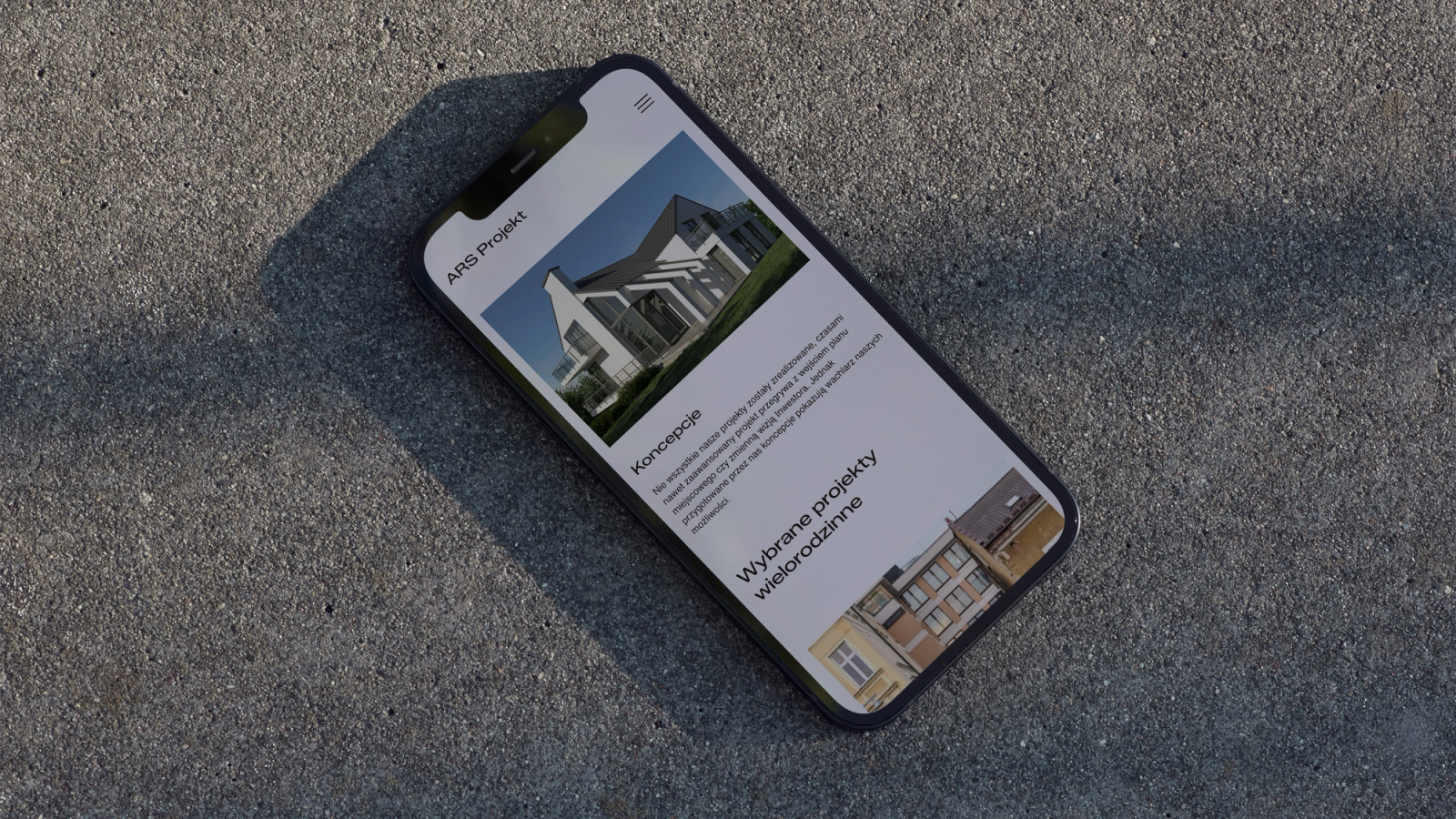
Ars Projekt – a portfolio website for a Kraków architecture studio
For the Ars Projekt studio we designed and built a fully custom WordPress theme whose information architecture serves one goal: showcasing the impressive portfolio of Kraków architect Roman Szczypuła.
Blog
Related articles
Development
Web design in Kraków – how to choose a partner and what you'll really pay
The Kraków web design market spans everything from €300 template sites to €40,000 platforms. How to compare offers, what to ask an agency, and when a local partner genuinely matters.
Development
A website redesign without losing your Google rankings – a migration guide
A new website doesn't have to mean a drop in Google. We show how to prepare a URL audit, a 301 redirect map and post-launch monitoring, step by step.
Development
How much does a website cost in 2026? A realistic pricing guide
From €800 for a template site to €40,000+ for a corporate platform. We break down what actually drives the price of a website and how to read agency quotes.
Development
Core Web Vitals and site performance – why speed sells
A slow website loses customers twice, in Google (lower rankings) and after the visit starts (abandonment). We explain LCP, INP and CLS, and how to genuinely improve them.
Planning a new company website?
Design and code grow in one team, so what you approve in the mock-up reaches production with no surprises. Scope and quote within a few days.
Prefer to reach out directly? hello@sweetlava.eu · +48 507710227