Skip to content

Culture

Sinfonietta Cracovia – a new logo and identity for an orchestra

A new mark for the Orchestra of the Royal Capital City of Krakow: a baton cutting through a circle, a brand book and signage for the orchestra's home. Since 2019 this system has held together 50+ projects we've designed for the ensemble.

Agnieszka Wróblewska Jerzy Koenigshaus

The Sinfonietta Cracovia logo reversed on black

Context

A city orchestra since 1994, a mark since 2019

Sinfonietta Cracovia, the Orchestra of the Royal Capital City of Krakow, has played as a municipal cultural institution since 1994, and its roots go back to the Young Krakow Chamber Musicians ensemble founded in 1990. Since 2014, under director Jurek Dybał, it has grown into one of Europe's most interesting chamber orchestras, valued above all for contemporary music. The old mark no longer matched that energy.

In 2019 we designed the third mark in the orchestra’s history, along with a brand book, signage for its home and a system of printed materials.
The Sinfonietta Cracovia logo with the orchestra's full name
The full-name version.
The full-name logo reversed on black
Reversed on black.

The mark

A baton cuts through the circle

The orchestra's name is long, yet it has to work even as an avatar. So we broke it into syllables: SINFO, NIETTA, CRACO, VIA, and set them inside a circle that closes the composition like a stage embracing the musicians. A diagonal cut of a baton runs through the whole: a single conductor's gesture that gives the static circle movement and rhythm.

The mark is black and white, as uncompromising as the ensemble's repertoire. It works in positive and reversed, on light and dark backgrounds, in Polish and English: 10 versions in total, 5 variants per language. For the smallest sizes there is a shortened signet with the letters S and C.

The Sinfonietta Cracovia mark in positive
The mark in positive.
The SC signet – the small-size version of the mark
The small-size signet.

The system

A brand book and signage for the orchestra's home

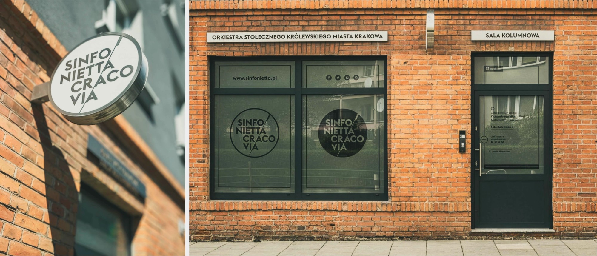
The mark got a book that documents its construction, clear space, typography and behaviour on photography and in partners' materials. We carried the same rules into physical space: the signage of the orchestra's home speaks the same language as the posters, so a guest recognises the brand from the front door.

Sign and shopfront of the Sinfonietta Cracovia home
The orchestra's home signage.

Collaboration

Over 50 projects in one system

The identity has proven itself in practice: in an ongoing collaboration we've designed over 50 projects for the orchestra, from catalogues, through button badges, to print accompanying the concerts. Agnieszka Wróblewska and Jerzy Koenigshaus are responsible for the mark and the system.

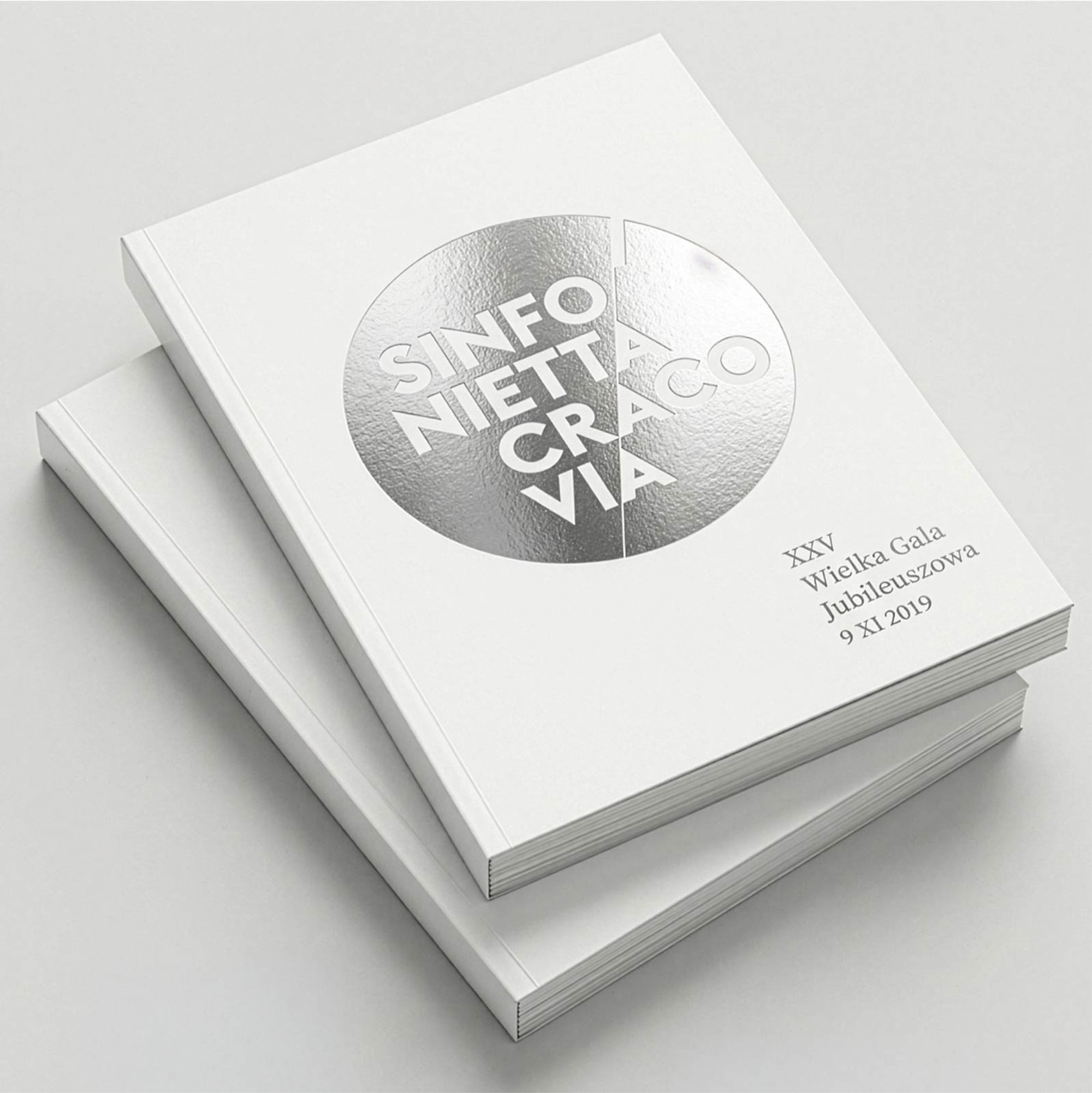
The 25th-anniversary gala catalogue with silver foil
The jubilee gala catalogue.
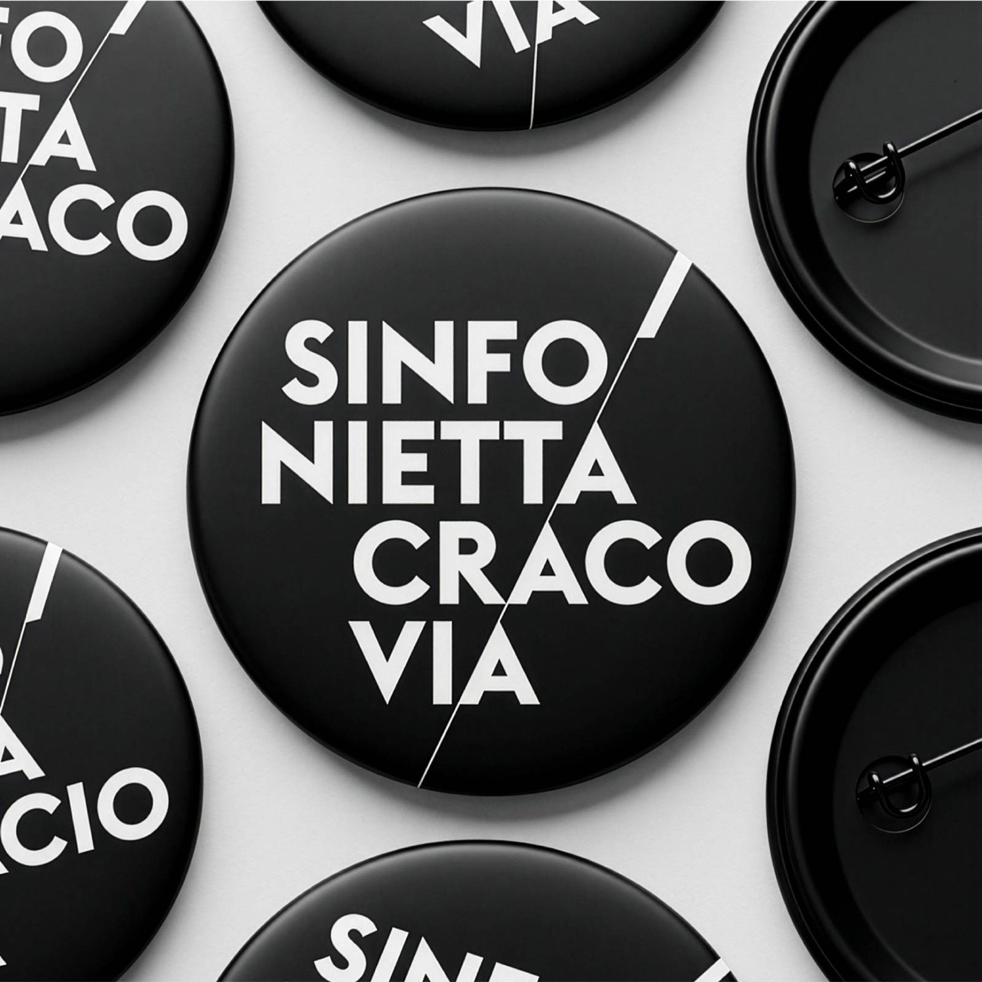
Button badges with the Sinfonietta Cracovia logo
Badges with the logo.

Result

A mark that plays along with the orchestra

After the logos of 1994–2014 and 2014–2019, the orchestra now has a mark that joins classical form with the energy of a contemporary repertoire. Black, white and a single cut of a baton are enough for the communication to speak with one voice, from an avatar to the facade of the orchestra's home.

By the numbers

2019
the year the mark was created
10
versions of the mark (2 languages × 5 variants)
50+
projects designed together

Related services

Related projects

Blog

Related articles

Branding & typography

Brand manual – what it is, what it contains and what it costs

A brand manual is the instruction manual for your logo – mark versions, clear space, colours, typography, examples of incorrect use. We explain what it should contain, how it differs from a brand book and what it costs.

Have an idea in mind? Let's talk.

Tell us about your idea and we'll recommend the best route from concept to a working product.

Get in touch