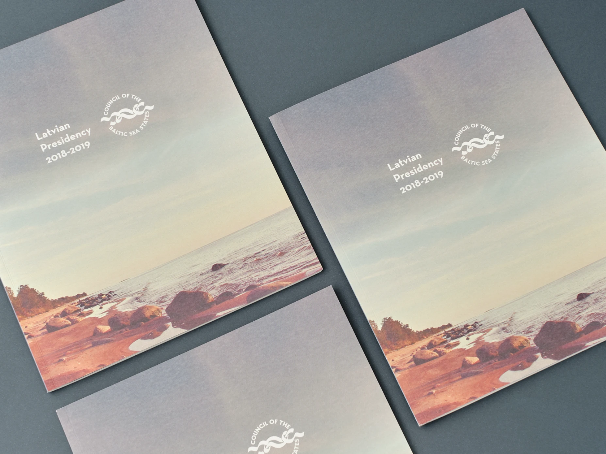
The Council of the Baltic Sea States (CBSS) is an intergovernmental forum for the countries of our region, set up for broad economic and environmental cooperation. Every year a different country takes over the presidency, and each presidency ends with an extensive report summing up twelve months of work. For such a large, formalised structure the publication has to be flawless – in its typography, in the flexibility of the layout and in meeting the strict EU environmental standards of the production itself.
International organization
Annual reports for the presidencies of the Baltic Sea states
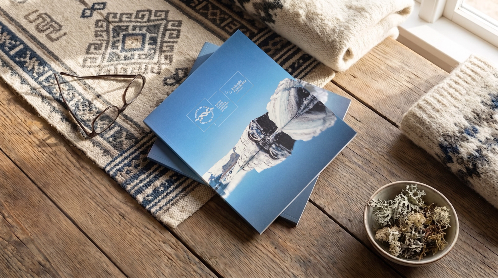
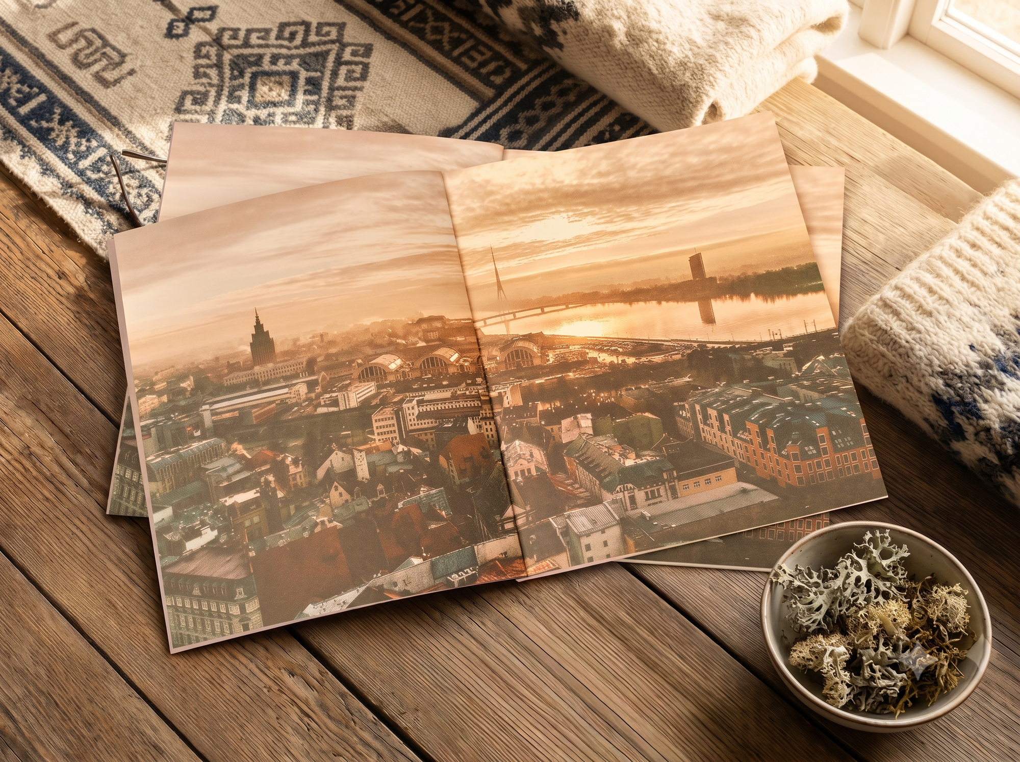
Between 2013 and 2019 we produced a series of annual reports for the Council of the Baltic Sea States. Each report covers a different country's presidency.
Context
Wyzwanie
When we started the collaboration in 2013, fully remote work was far from the market standard. We ran the whole process – from cover design, through typesetting dozens of pages from supplied materials and quoting, to sourcing certified ecological papers – without a single status call. We exchanged e-mails with people we'd never seen in person, sent trial layouts, applied corrections and shipped the finished print run to Sweden. It was a test of self-reliance and precision in DTP.
Grid and space in the design
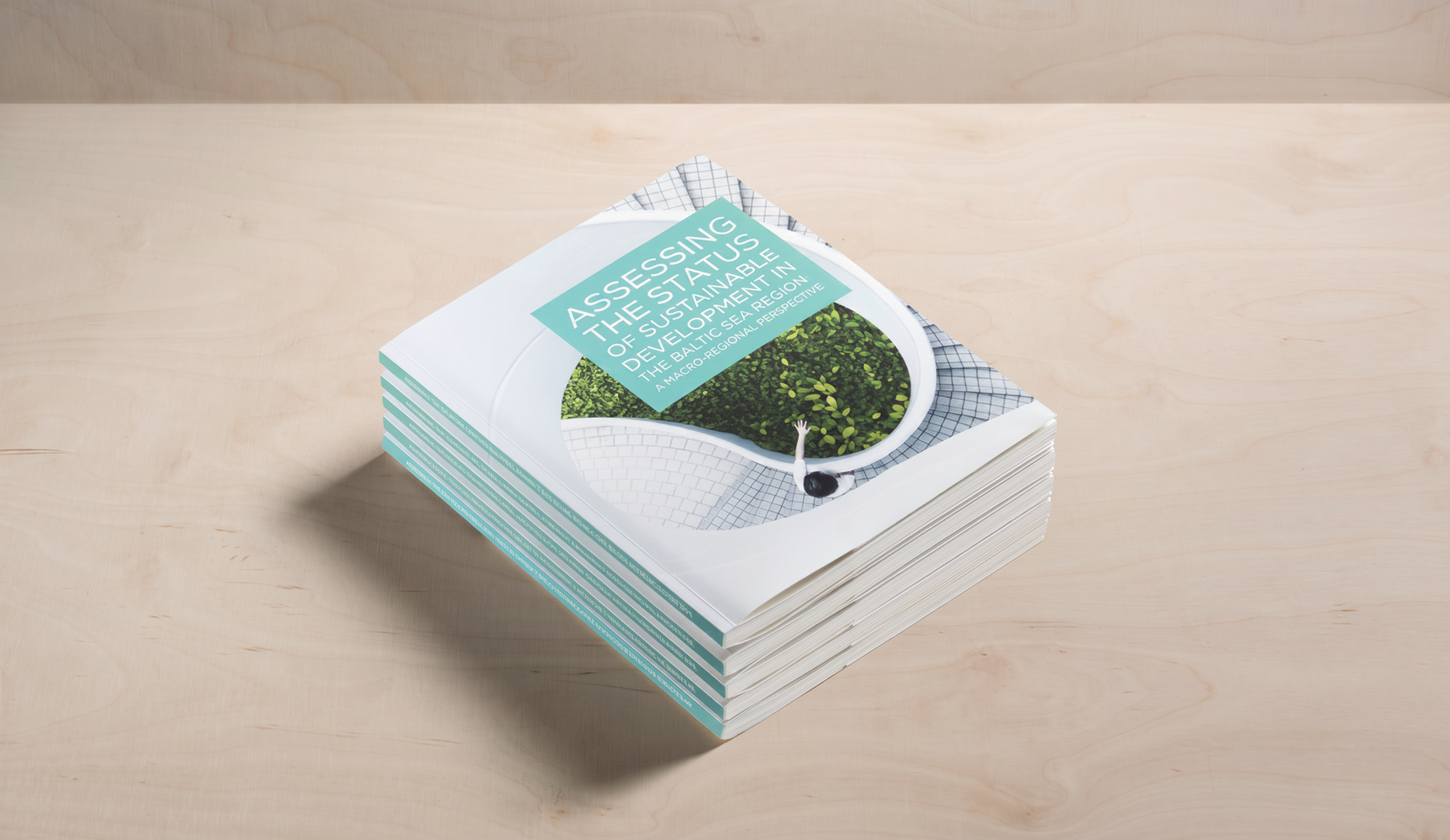
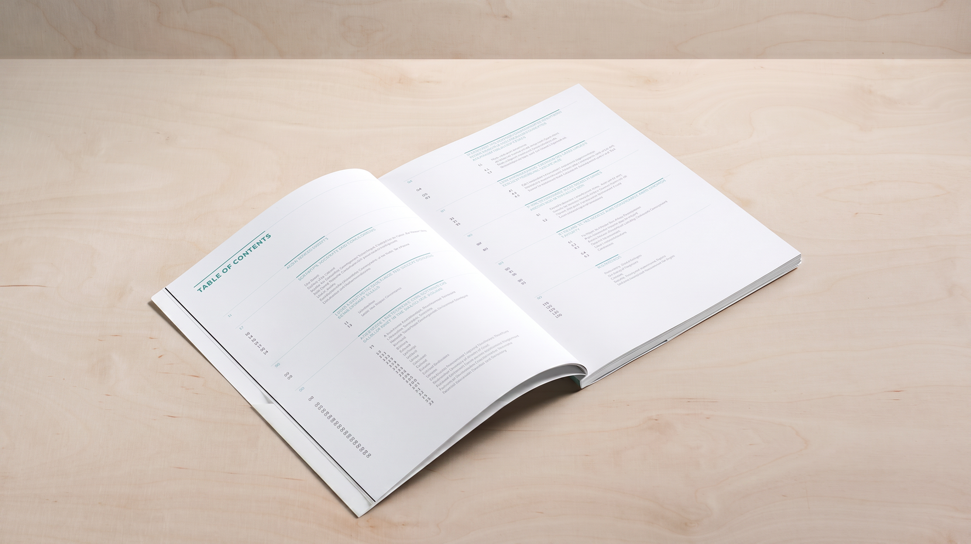
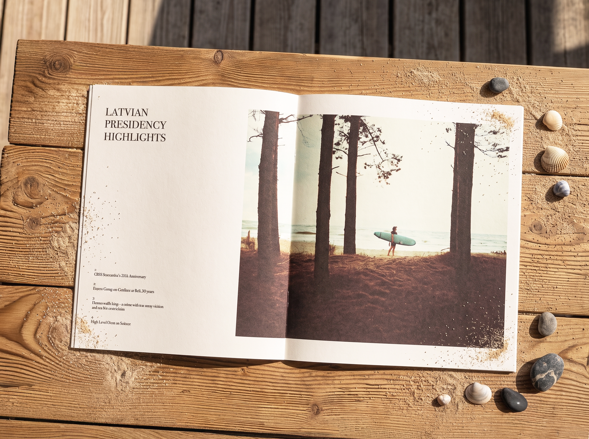
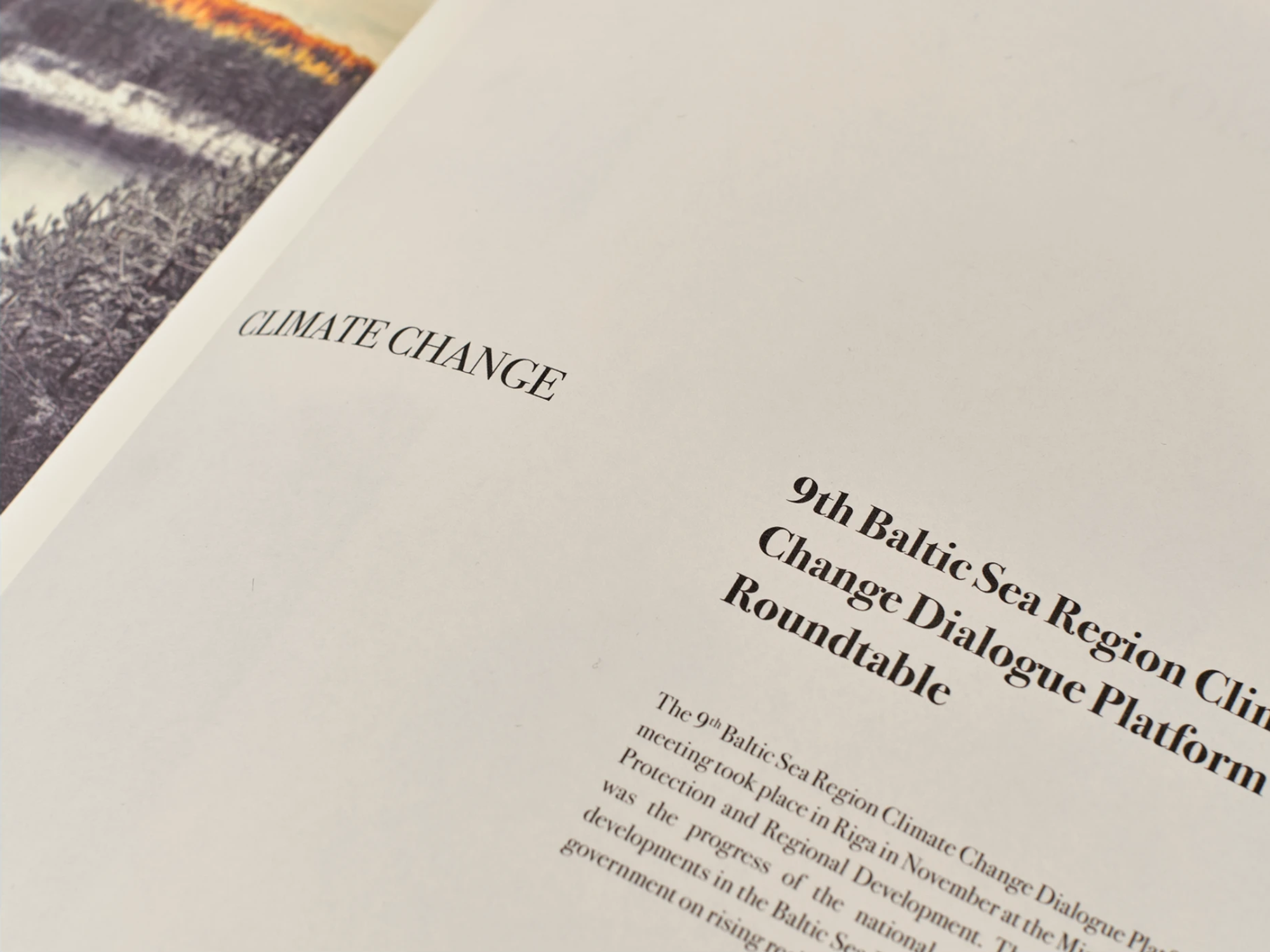
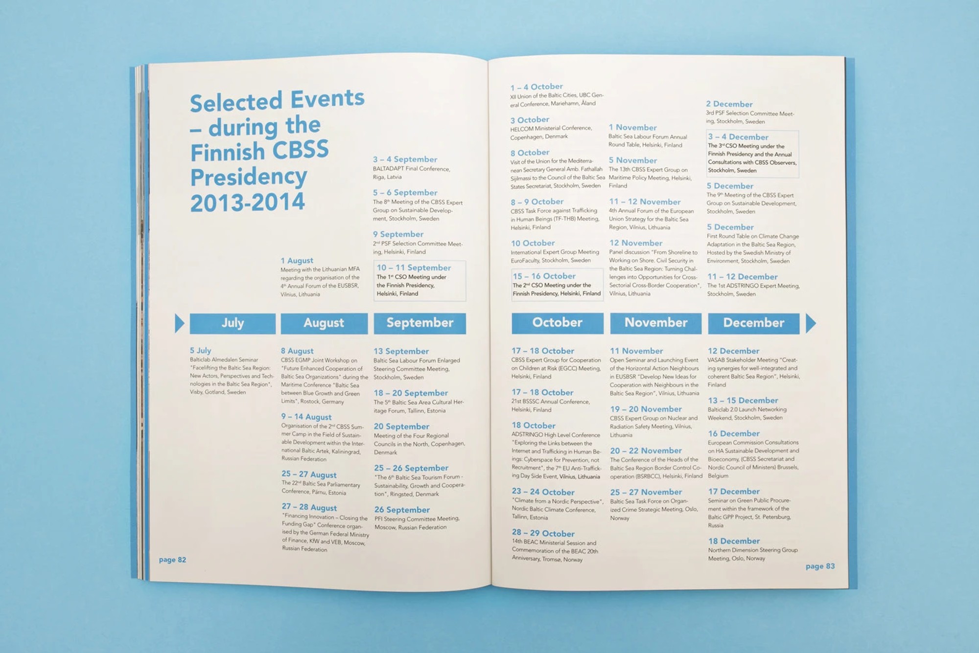
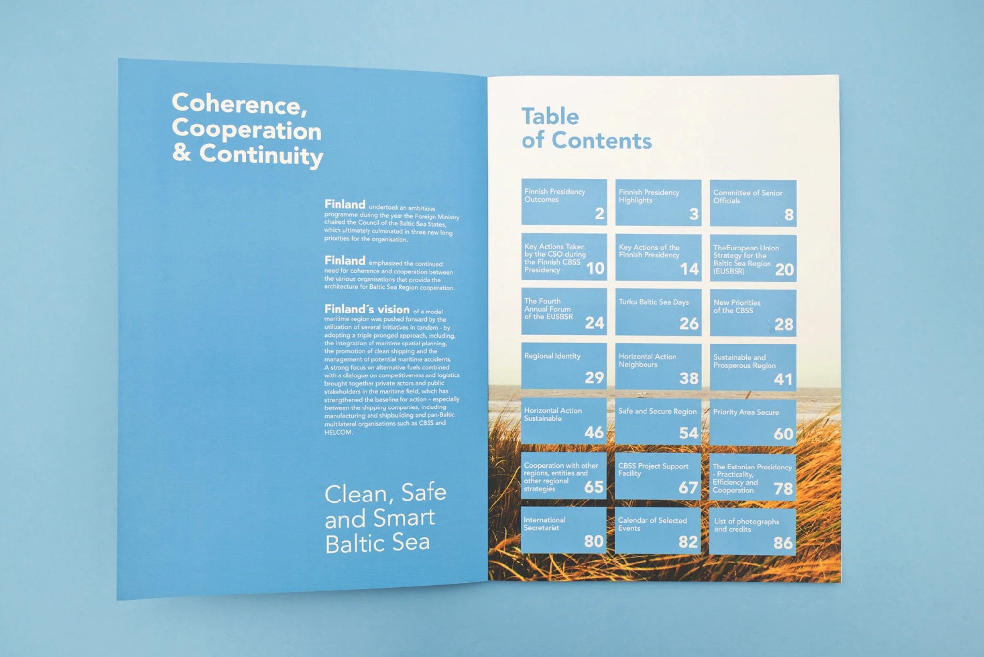
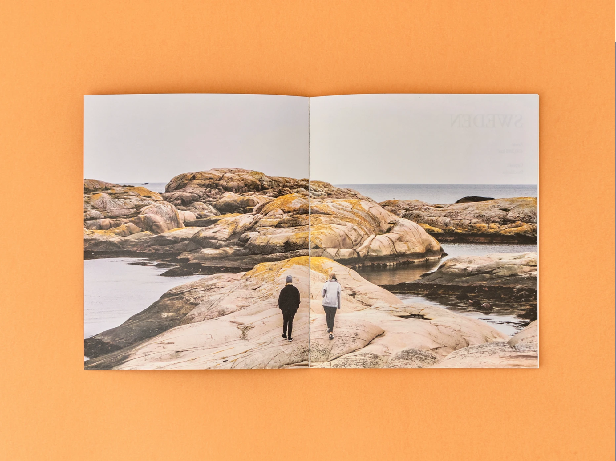
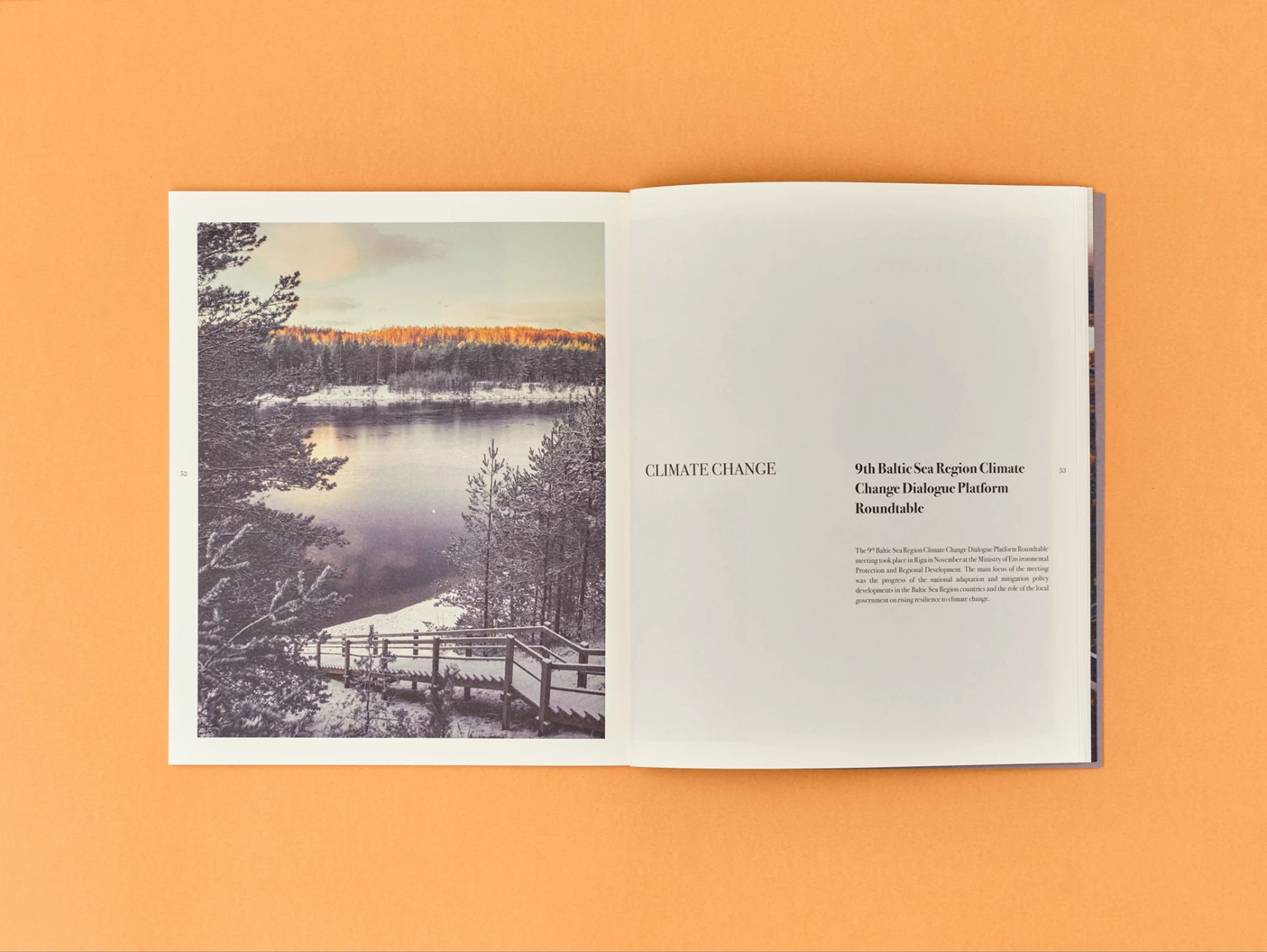
Large publications demand discipline, so every report was built on a precise modular grid. That invisible grid kept the pages legible and the layout clean regardless of how much text arrived. We wanted the typesetting and the photography to balance the white space naturally, giving the reader room to breathe. Photo editing was a real challenge here: the images came from many different sources, so detailed colour correction and unifying their mood were essential for the printed whole to read as one consistent story.
Detail in DTP
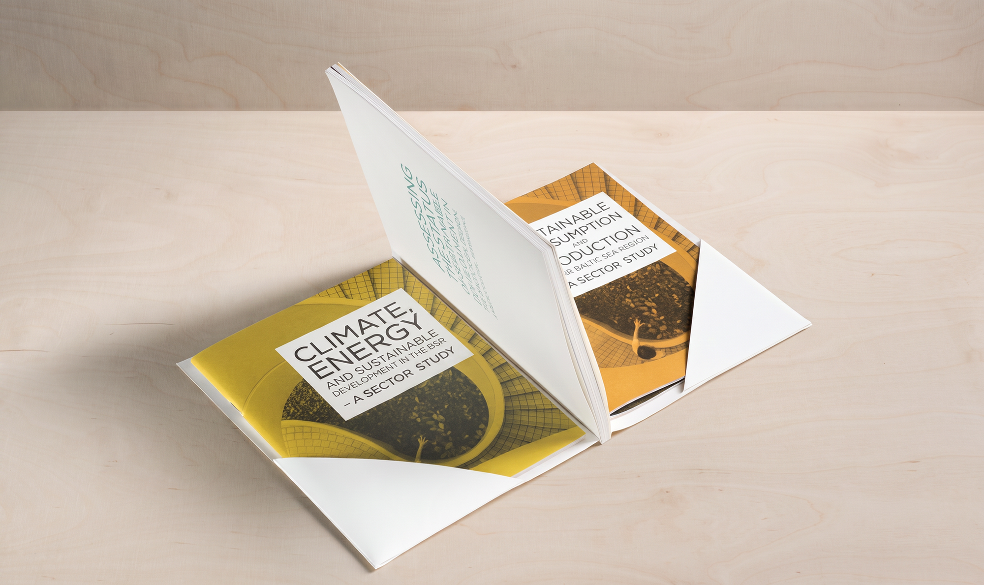
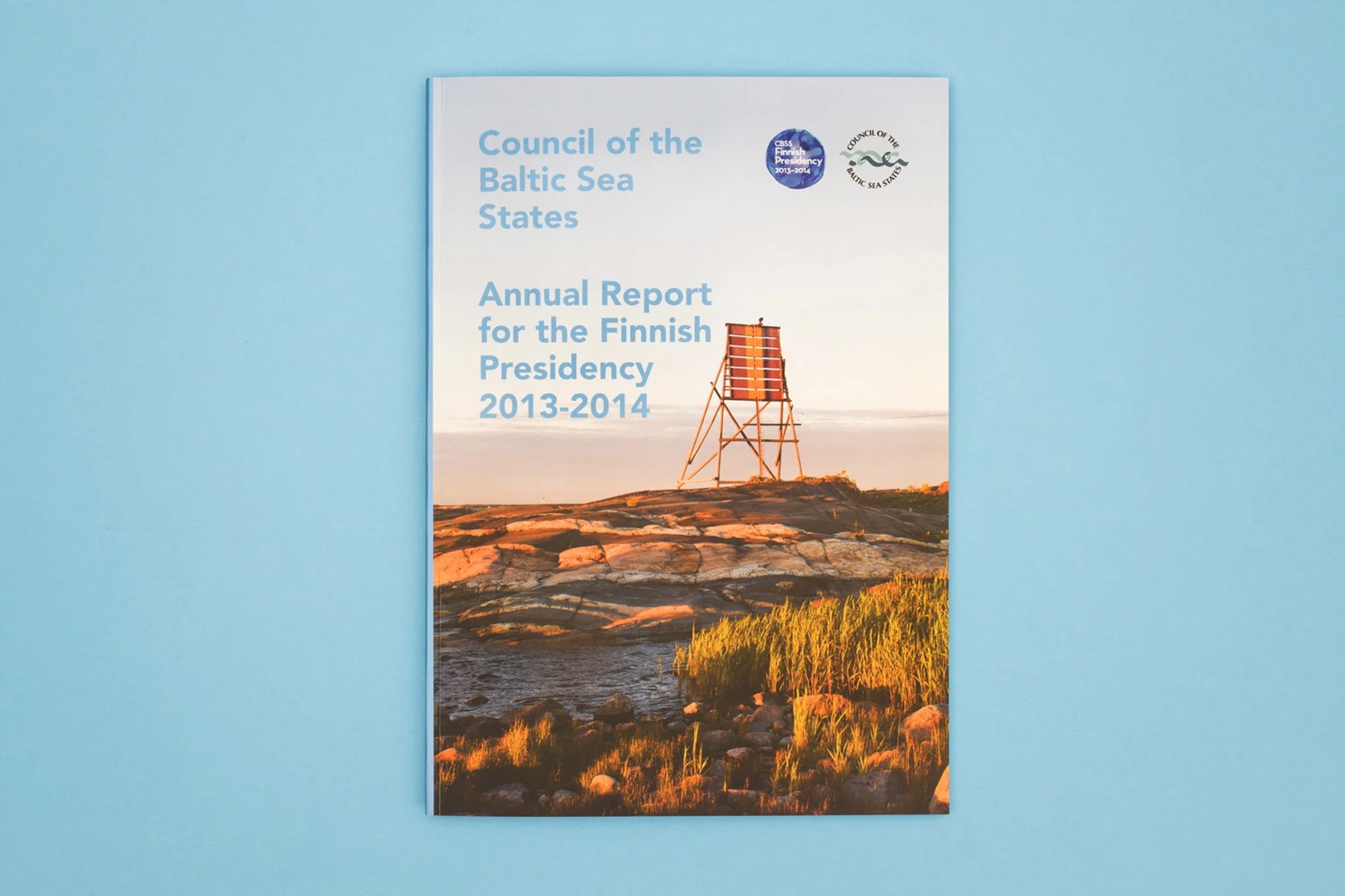
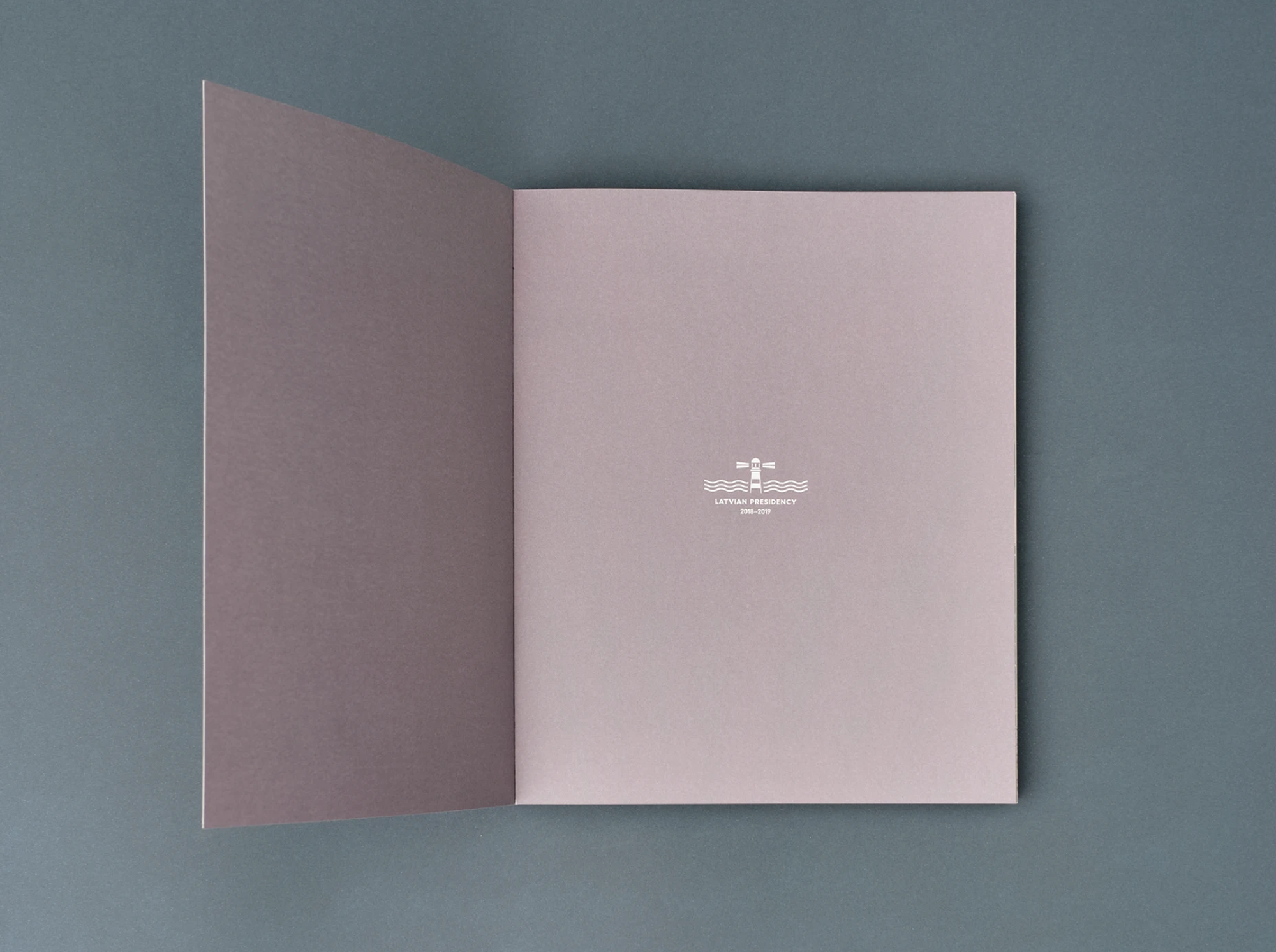
In print projects the charm always sits in the bookbinding details. The DTP process let us go beyond the flat page and propose extra touches. We designed covers with special triangular, glued flaps that formed practical front and back pockets for additional folders. We also played with the paper format itself, deliberately inserting shorter leaves inside the block to visually separate chapters and give the photographs more presence. Cover finishes such as precise hot stamping or spot UV varnish reinforced the professional character of the publications.
Shipping to Iceland?
At the end of 2017 we were shipping the reports to a key conference in Iceland. Bad weather stranded the pallets in a port while the event date kept closing in. Instead of panicking, we managed to reach an employee of the Icelandic warehouse by e-mail, who personally made sure the parcels left on time. Looking back from today's culture of everyone constantly monitoring everything, the client's calm and patient wait for the outcome remains for us the finest proof of real business trust.
Outcome
Around 2019 the organisation revised its publishing policy: in the name of a radical approach to ecology and saving paper, the CBSS decided to move its reports entirely into digital space. Our collaboration over those years went beyond the annual summaries – we also designed and typeset some very demanding publications for them, from climate reports to materials on the difficult, heavy subject of human trafficking.
Realisation: as part of Mill Studio
Product photography (on plywood): Przemek Szuba
Photos of the spreads on coloured backgrounds: Borys Borecki
By the numbers
- 7
- reports published
- 548
- pages typeset
- 1
- happy client
- 2100
- copies printed
Related services
Related projects
Consumer brand
Gerlach – printed materials and packaging
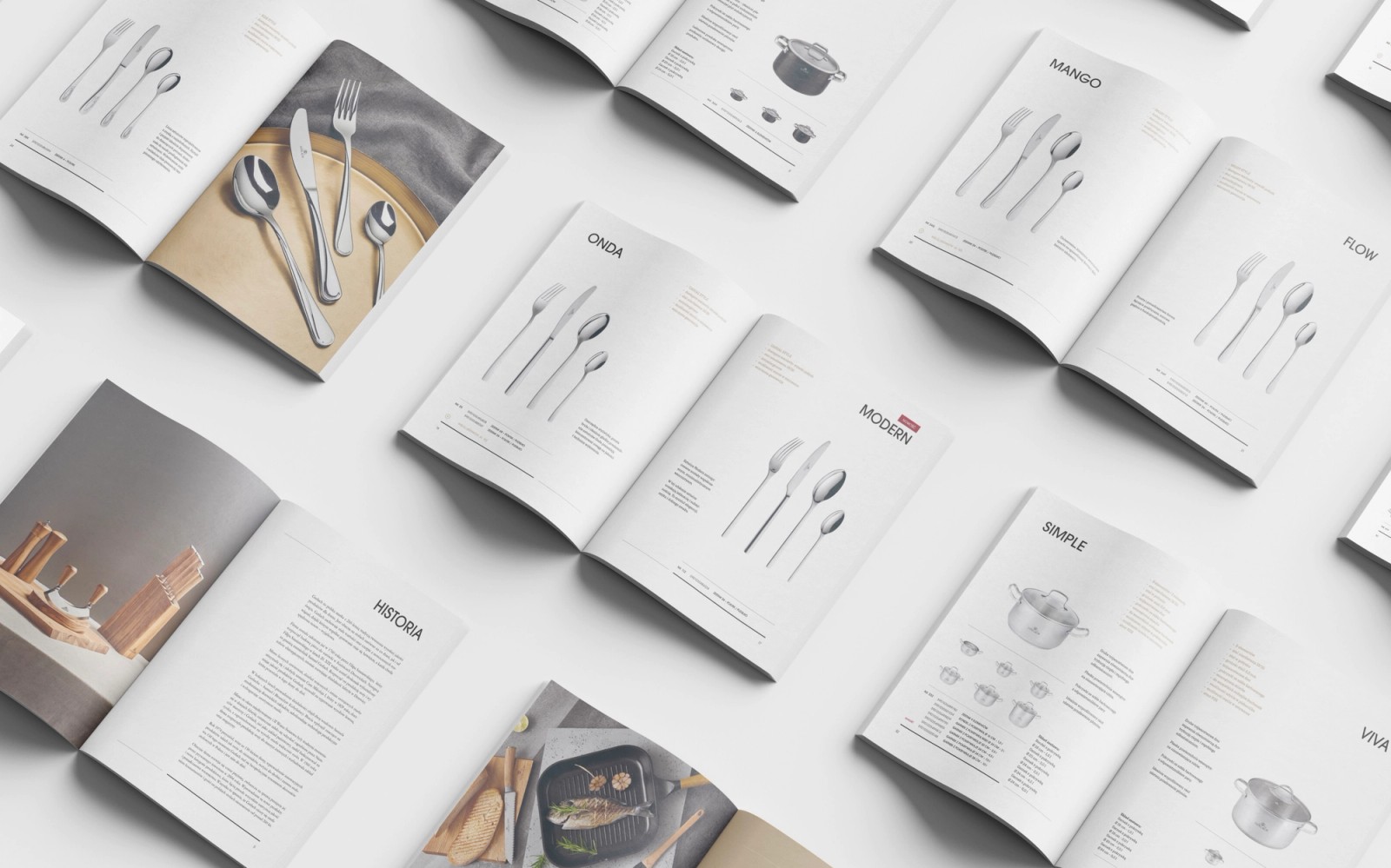
Four product catalogues in Polish and English, an icon set, five types of brochures, the cover of a book on the brand's history and a packaging series for Gerlach, a brand trading since 1760.
Culture & tourism
Coal Mining Museum in Zabrze – 7 years of building a brand from the inside
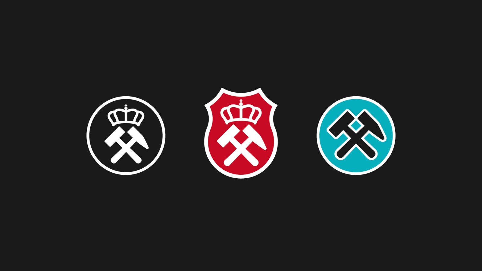
A different kind of story. Before Sweet Lava existed, Jerzy spent seven years building the brands of the Guido Mine, the Queen Louise Adit and the museum itself from the inside. Three identities, hundreds of print pieces, photo sessions and 7 advertising campaigns.
Blog
Related articles
Branding & typography
Brand manual examples from real projects – and what to look for in them
Three brand manual examples from our own projects, from a cultural institution to an orchestra. What a good manual contains, how to read other brands' PDFs and how to spot a document that actually works.
Branding & typography
Brand manual – what it is, what it contains and what it costs
A brand manual is the instruction manual for your logo – mark versions, clear space, colours, typography, examples of incorrect use. We explain what it should contain, how it differs from a brand book and what it costs.
Branding & typography
Typography in digital design – how typeface choice shapes brand and conversion
Typography is 90% of web design – almost everything a user sees is text. On how typefaces build brand character, readability and sales results.
Branding & typography
A company's visual identity step by step – from logo to design system
How a professional visual identity is made. The process stages, what a good brand book contains, examples from real projects, prices and the moment it's worth growing the identity into a design system.
Preparing a catalogue, a book or another publication?
We design and typeset publications for print, from layout to production files. Quote within a few days.
Prefer to reach out directly? hello@sweetlava.eu · +48 507710227