Miasta Gwarków (“Miners’ Towns”) links Tarnowskie Góry, Bytom and Zbrosławice into a single tourism trail around Silesian industrial heritage. The brand belongs to the Local Tourism Organisation and tells the story of the region’s three forces: ore, water and nature. We designed its complete visual identity: the mark, typography and colours, a set of graphic elements, photography guidelines and a family of physical carriers. We didn’t build the website, but the identity is ready to work just as well on screen as it does in print.
Culture & tourism
Miasta Gwarków – brand identity for an industrial heritage trail
A full brand identity for a tourism brand, from the mark to a system of carriers. Logo, typography, colours and rules that let the brand speak with one voice in print and on screen.
Agnieszka Wróblewska Jerzy Koenigshaus
Context
The challenge
The brand had to work everywhere: on an information post by a mine, on a poster, in a brochure and on social media. Industrial heritage is easy to present as heavy and museum-like; we wanted a mark that carries the region’s history yet invites you in. The second task was systemisation: the identity had to give the organisation tools with which one person could grow the brand alone, without guesswork.
A mark that begins with ripples on water
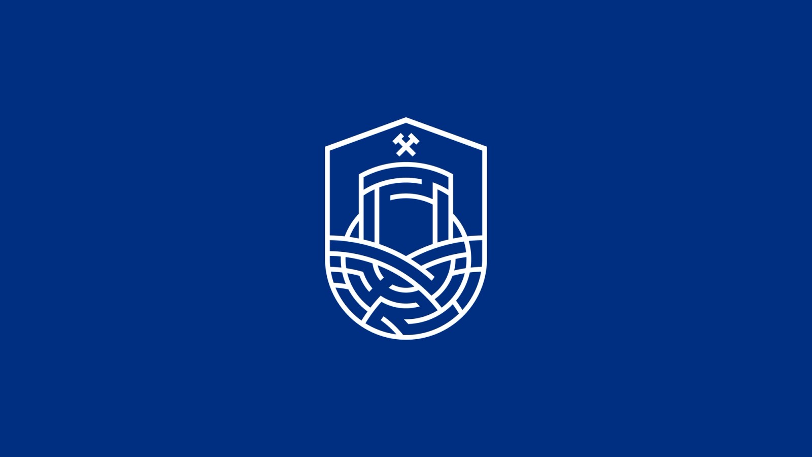
Neighbouring towns influence one another like ripples on water: each wave changes and blends into the next. That image became our starting point. From a layout of three circles, divided into mathematically defined segments, we derived the emblem, and into its abstract shapes we drew local icons: the kupla (a crossed hammer and pick, the traditional mining emblem), the Gwarki Gate, water and the rolling landscape. We closed it all in a synthetic heraldic shield.
The mark works in four variants: horizontal, vertical, with the full organisation name and as the emblem alone. Each has a defined clear space, a modular grid and minimum sizes, from 8 mm in print to 24 px on screen, so nobody has to guess which one to use.
Typography and colour
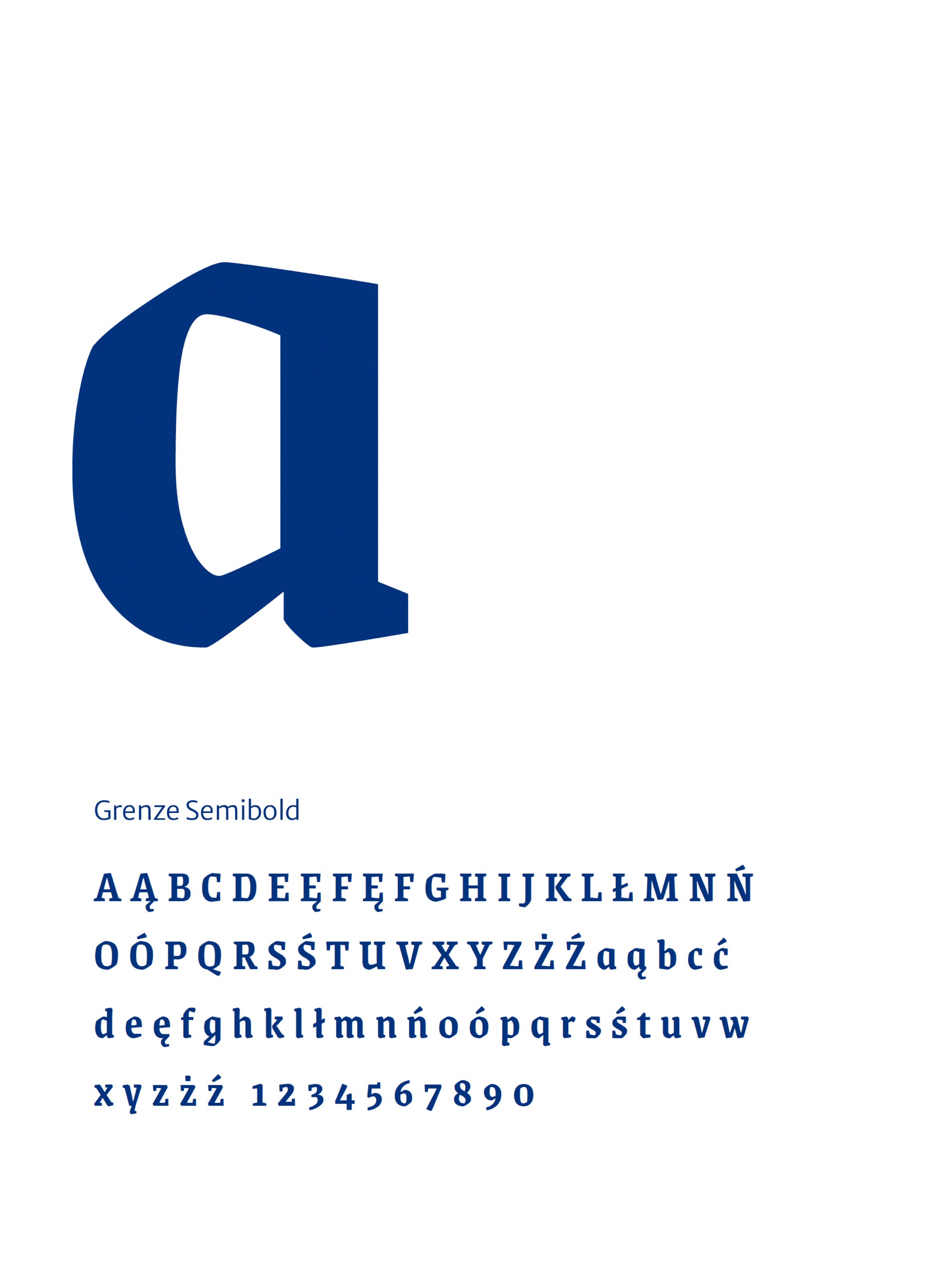
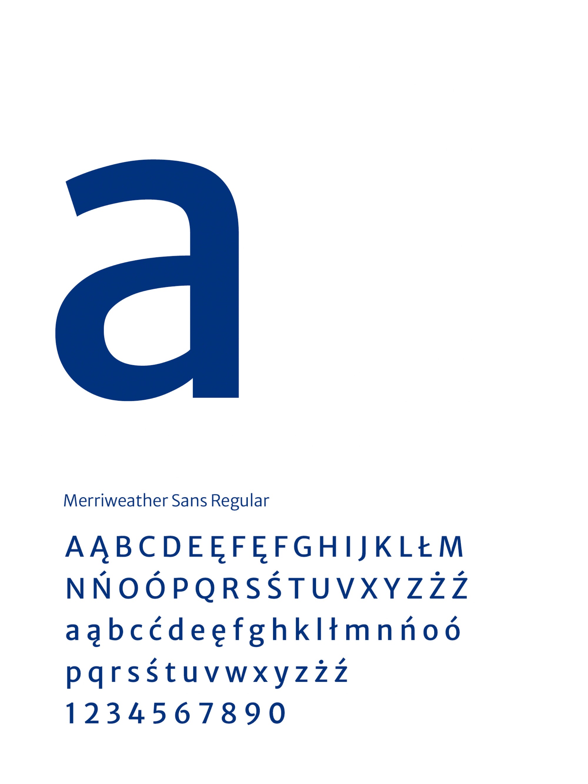
The logotype is set in Grenze SemiBold: a Latin serif with a subtle trace of the blackletter still present on Silesian tenements and plaques. Everyday communication runs on Merriweather Sans and its serif cousin Merriweather, with glyphs for over 100 languages and high legibility at small sizes. All the typefaces are free under the OFL licence and available on Google Fonts, so the brand pays no licence fees, including on its future website.
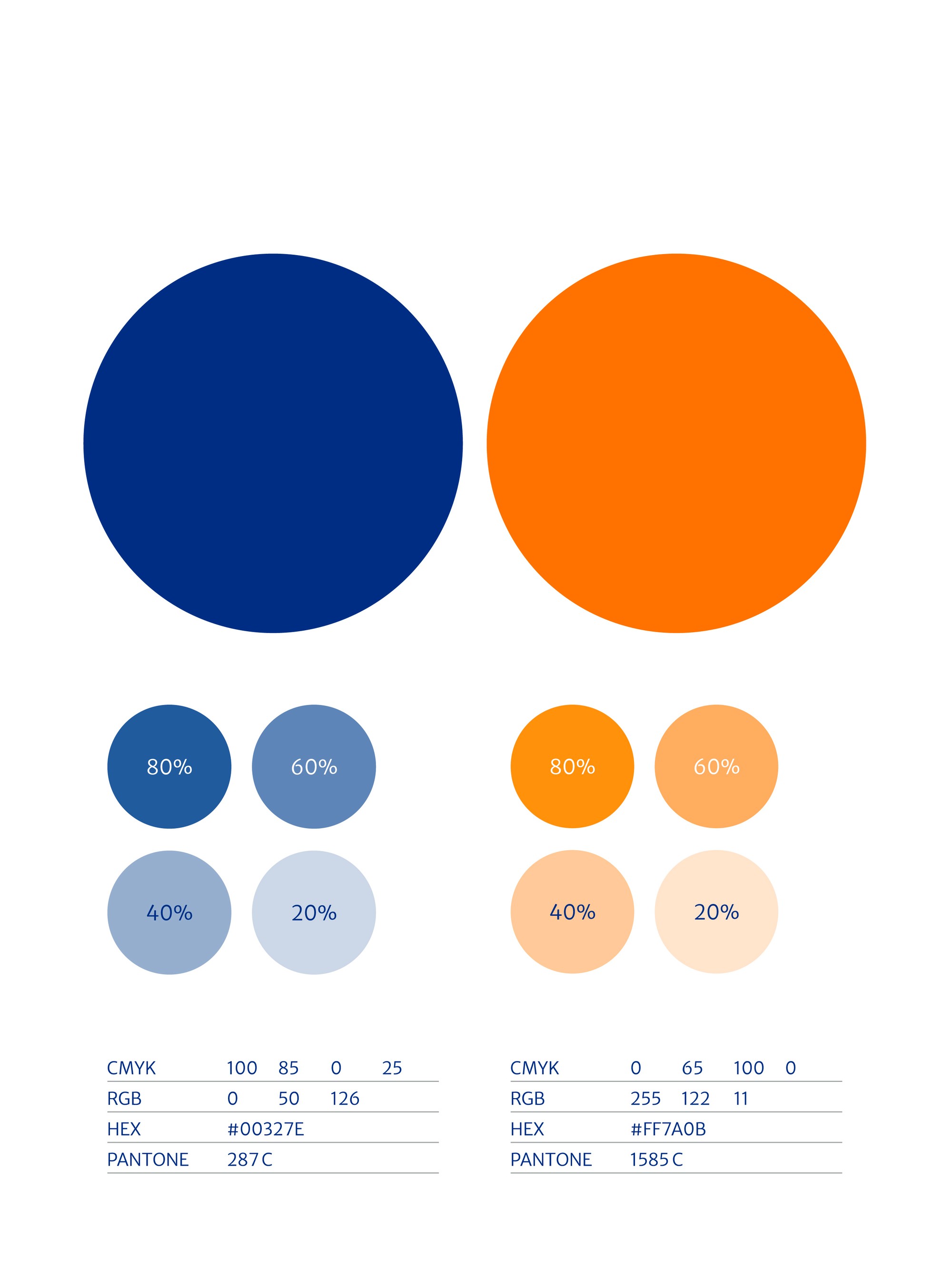
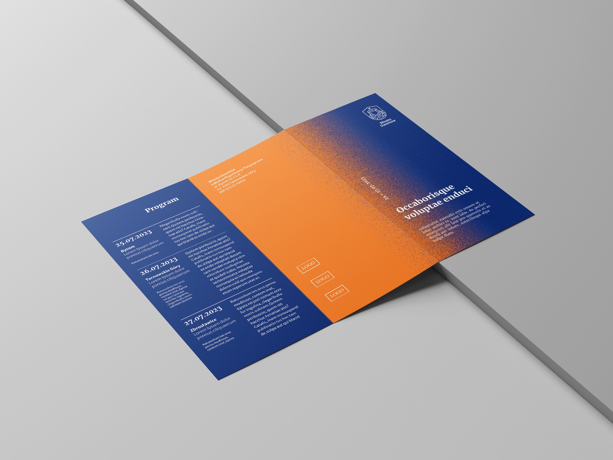
The palette rests on two colours. Navy (Pantone 287 C) brings the stability and gravity of heritage; orange (Pantone 1585 C) adds warmth and the energy of an invitation. A calm grey and a pastel pink support publications with a quieter tone.
Graphic elements
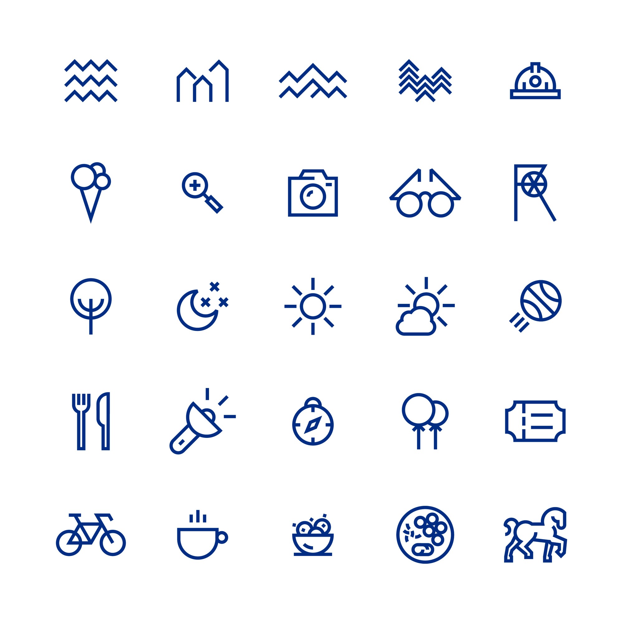
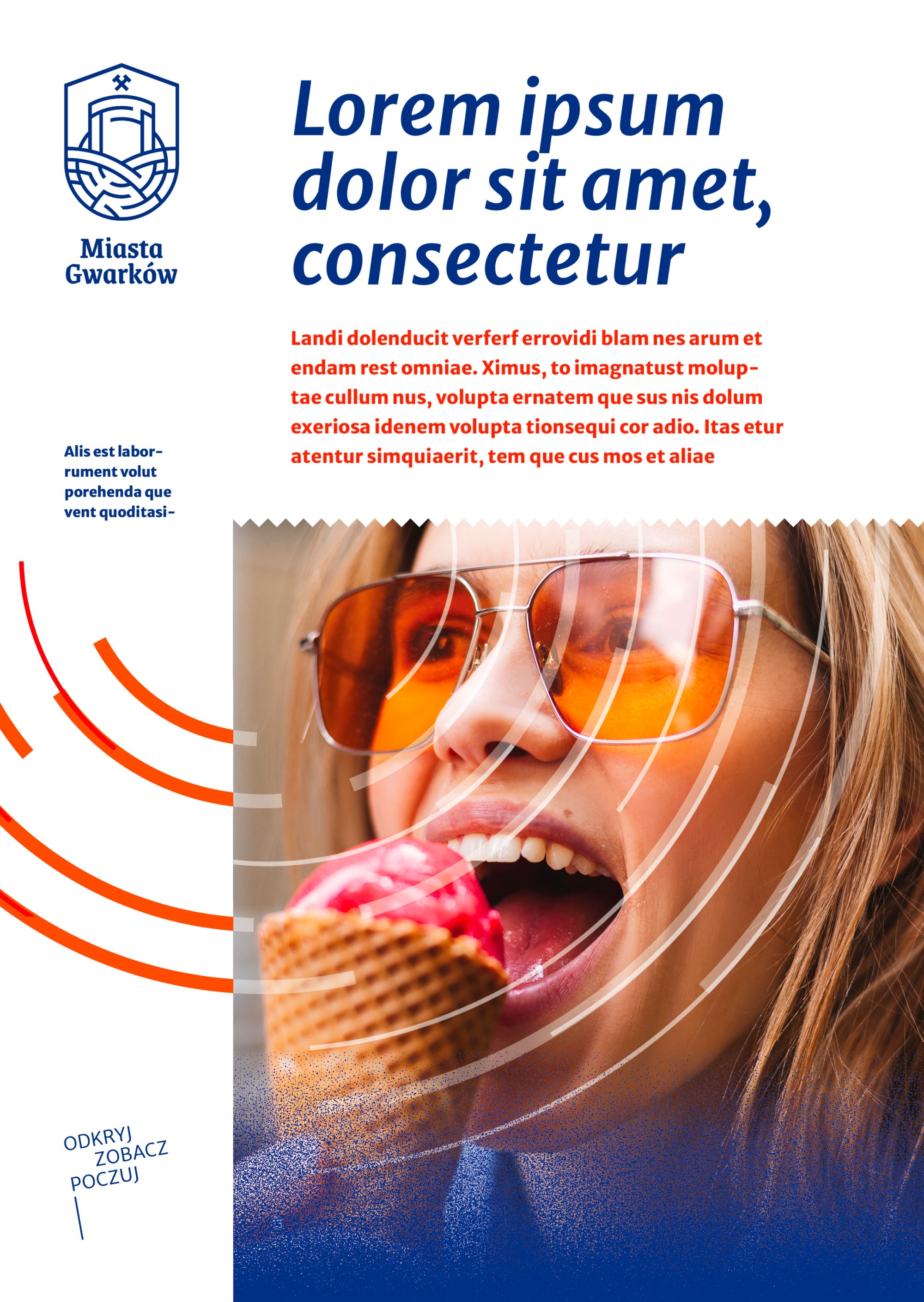
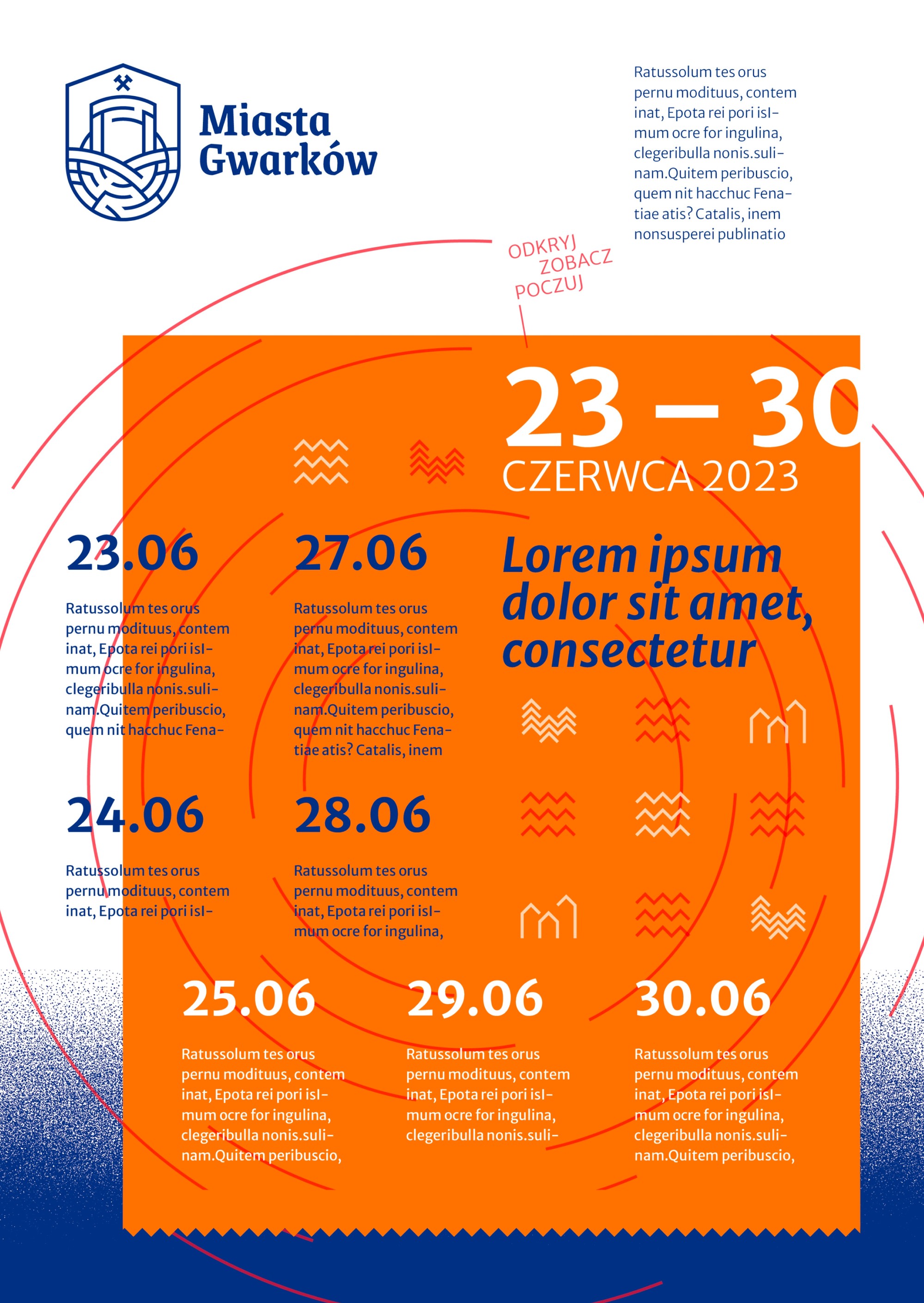
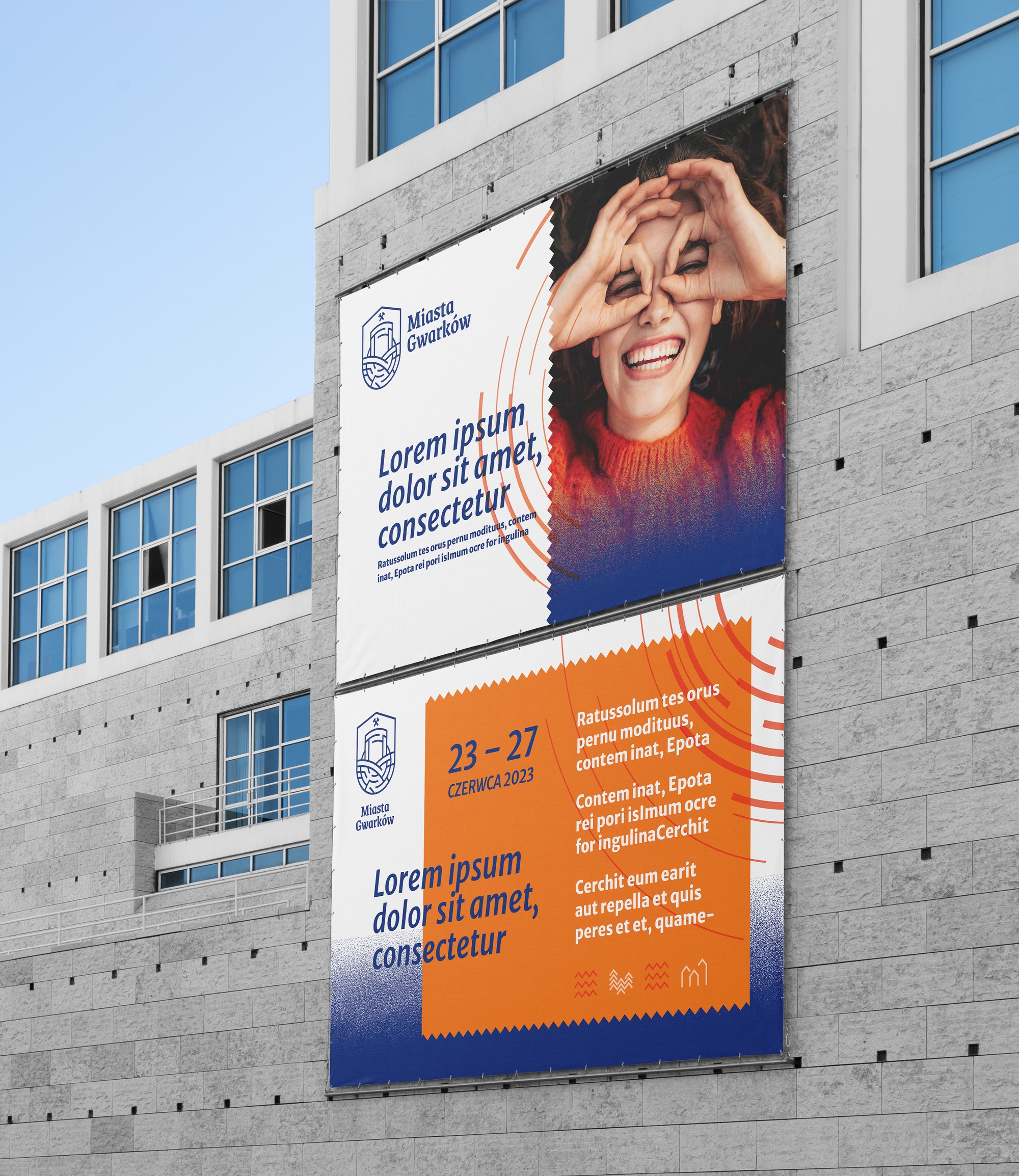
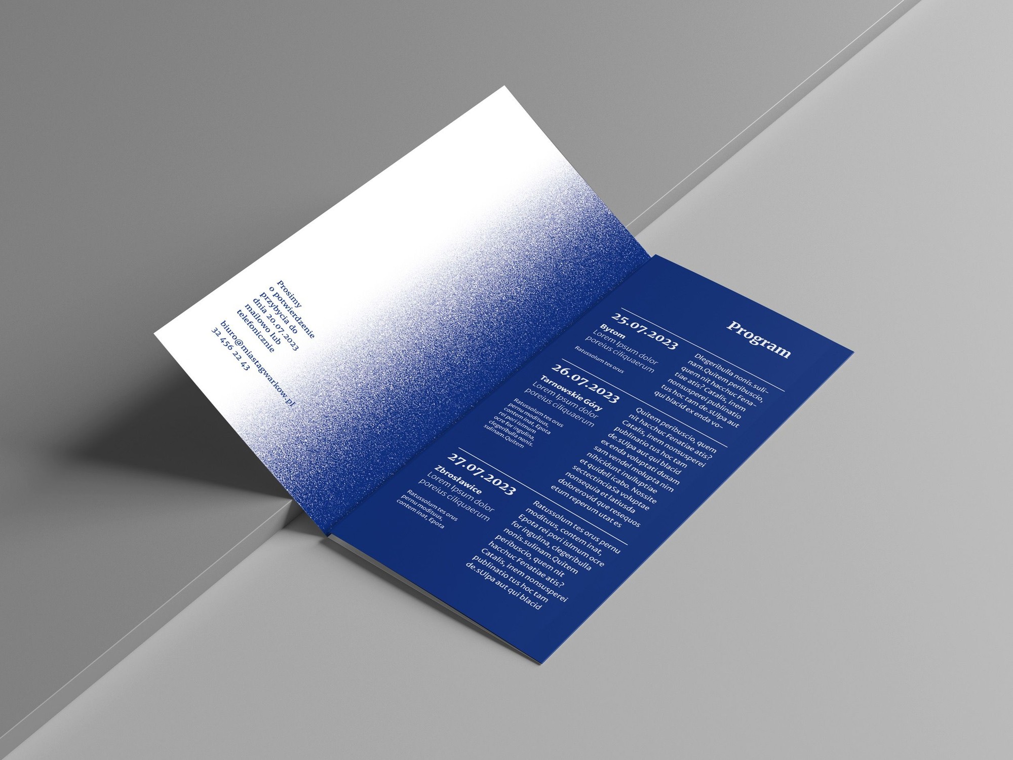
Every element of the system has its own job. The textured gradient builds backgrounds that photographs and typography sink into. Pictograms guide visitors around the trail faster than words. The zigzag recalls a ticket’s perforated edge and gives the materials a touristy, slightly retro feel. The rings are the same ripples the mark was born from, this time working as standalone graphics.
The system at work
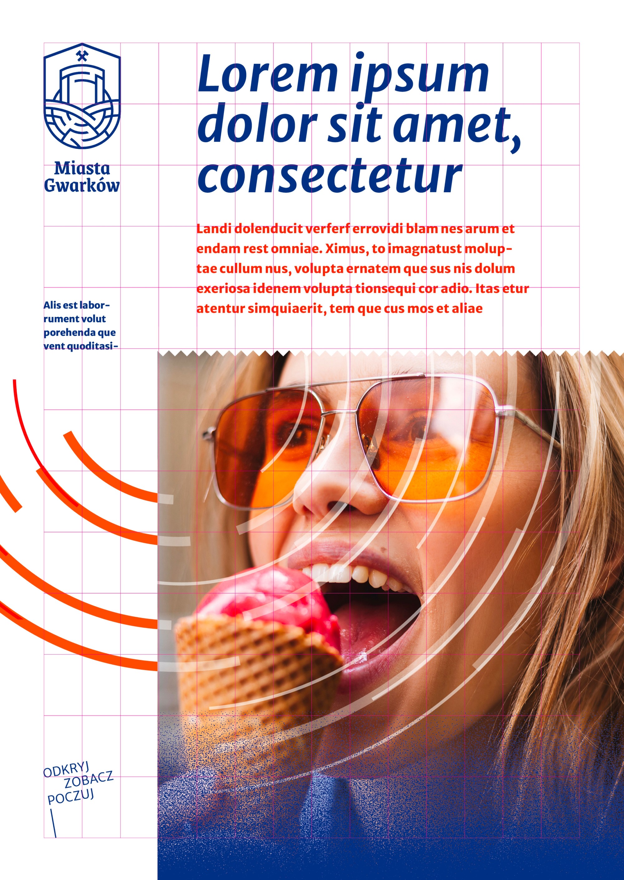
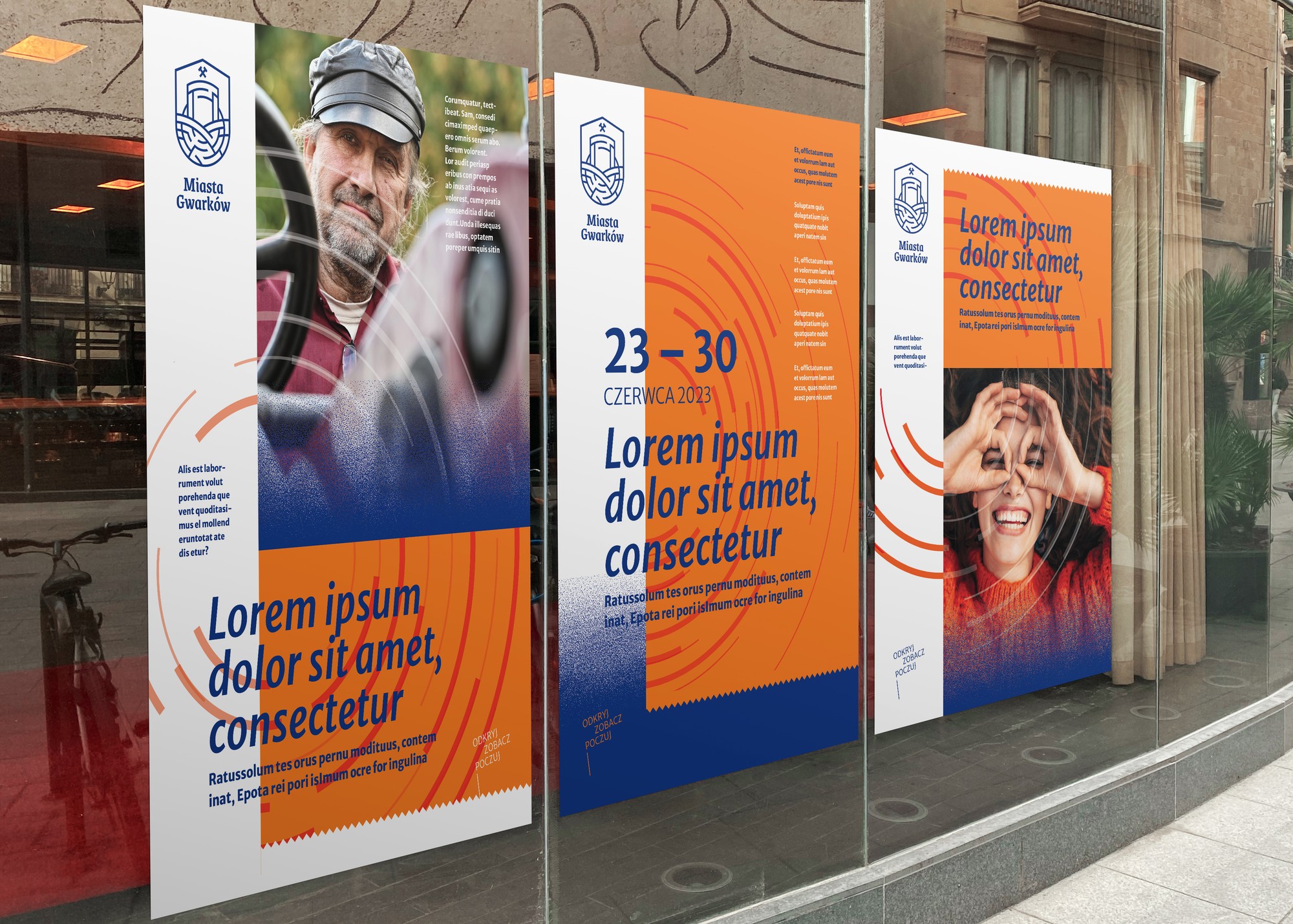
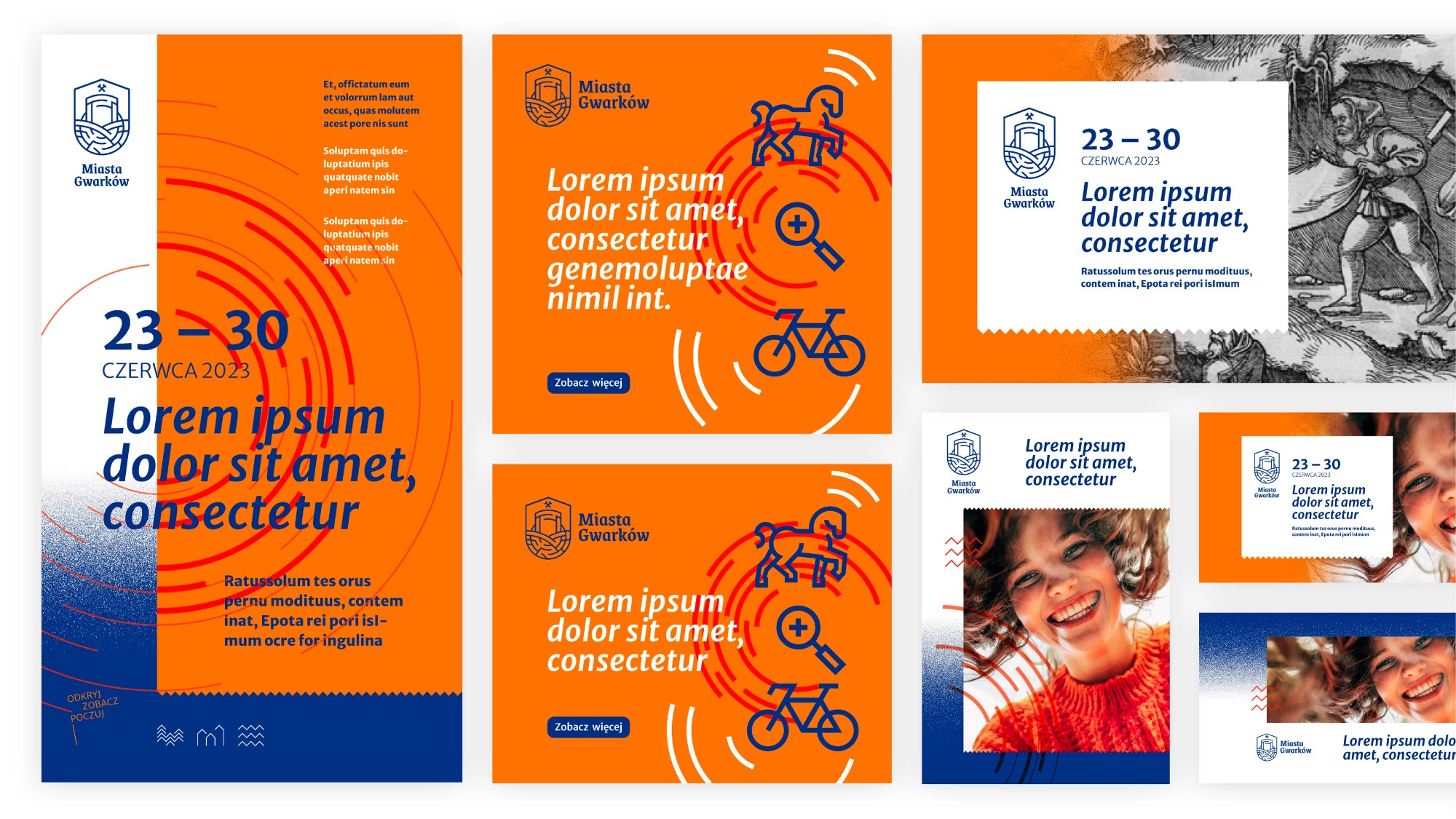
Poster and playbill layouts stand on compositional grids, so new formats come together quickly and consistently. For photography we built a matrix of themes that combines People, Culture and Nature into ready shooting scenarios: images show people in motion, discovering the monuments, rather than empty panoramas. The system also covers different moods: the full palette with the complete set of graphic elements suits events, while the restrained version handles serious content.
Publications and digital
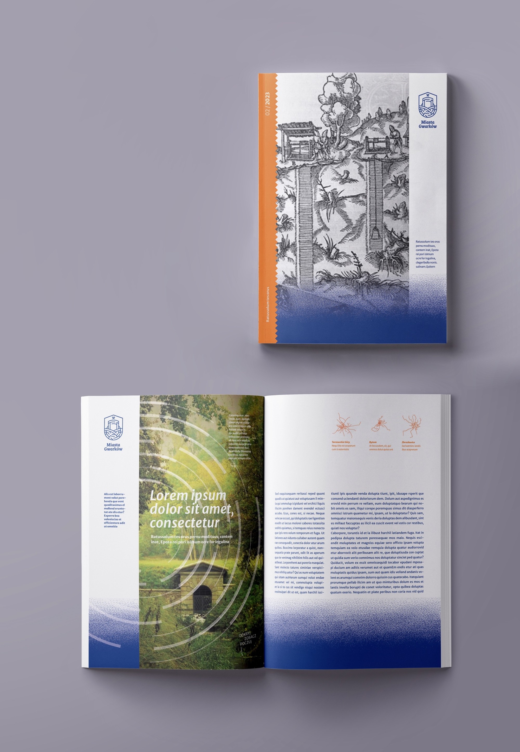
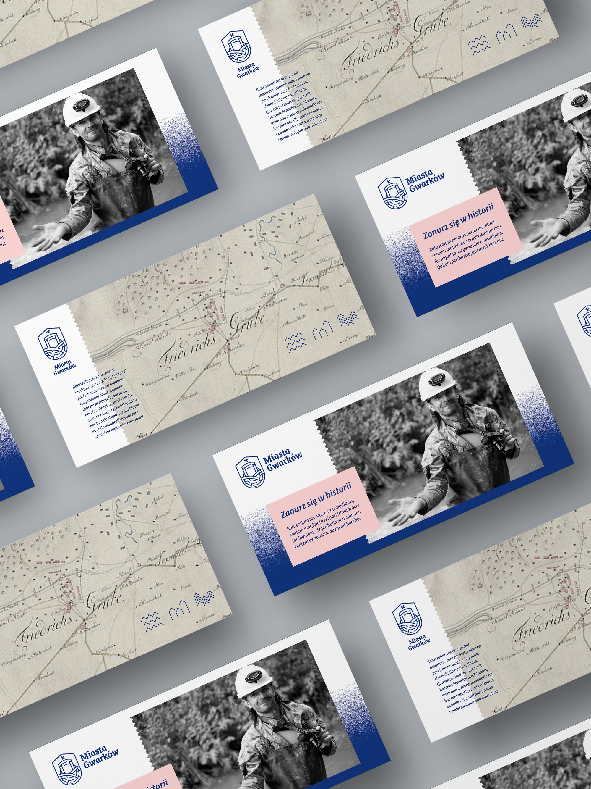
In print, the region’s history meets the present day: 16th-century mining engravings and archival maps of mining fields sit next to dynamic photography. On these rules we designed brochures, DL leaflets, invitations and event programmes, along with templates for posts, stories and banners, so social media can run without a designer on call for every post.
Carriers and merchandise
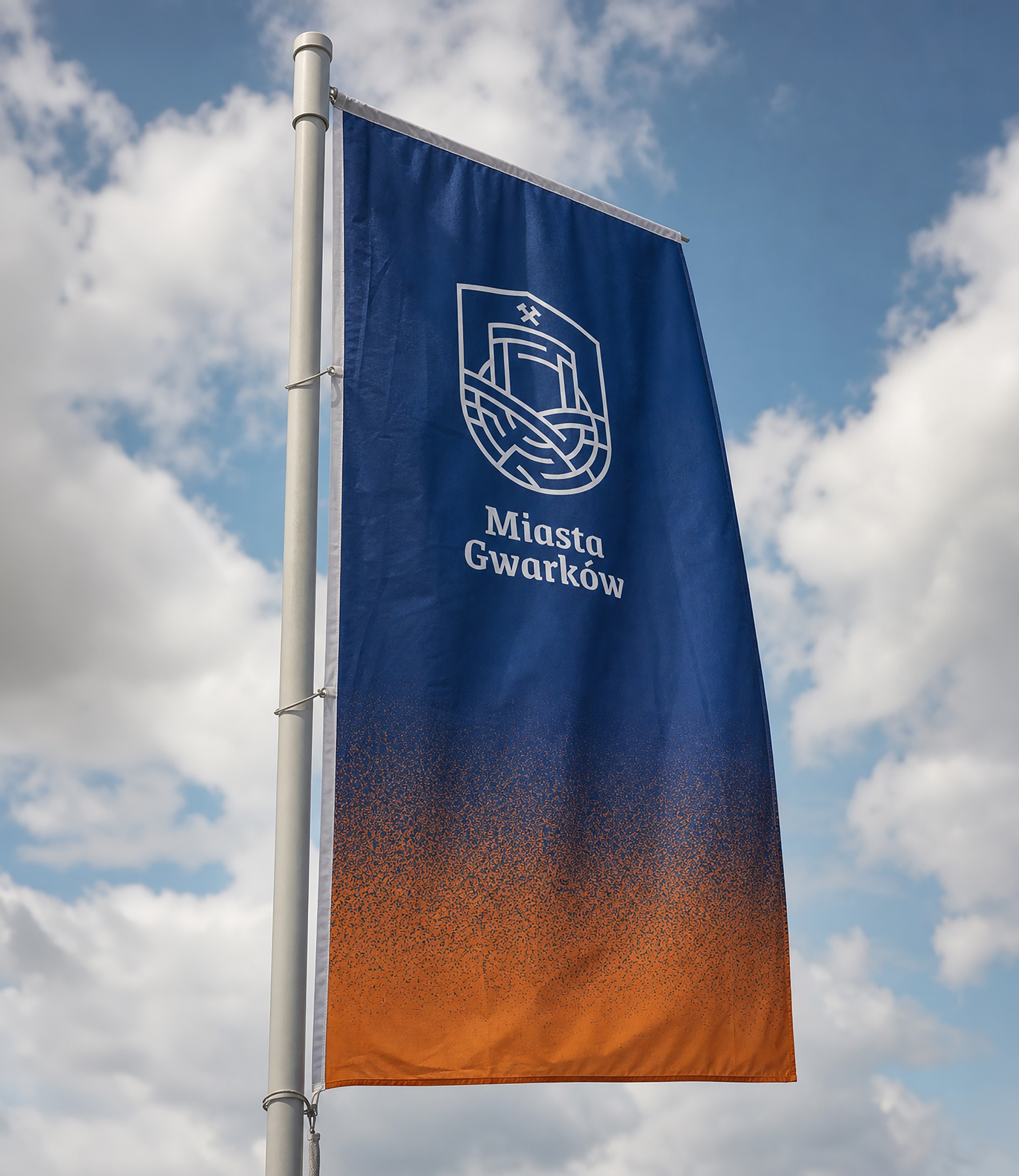
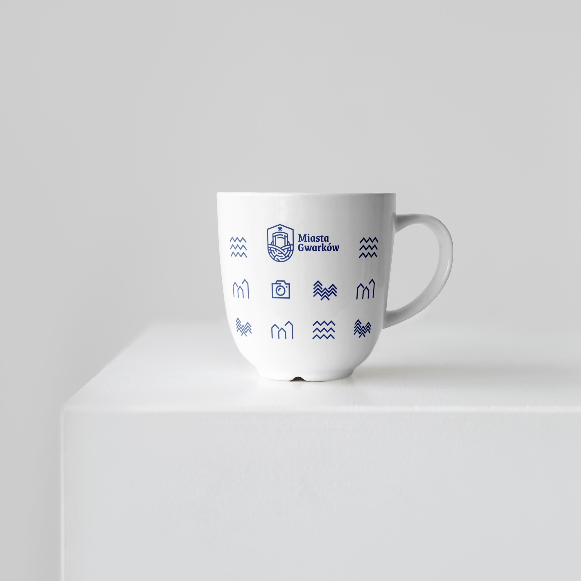
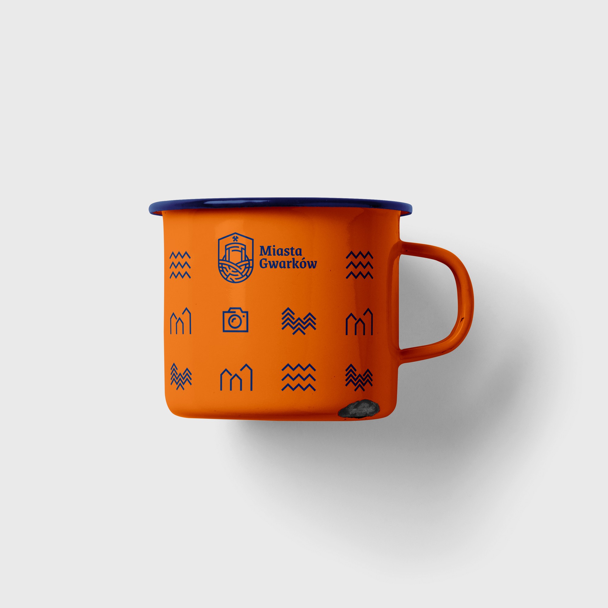
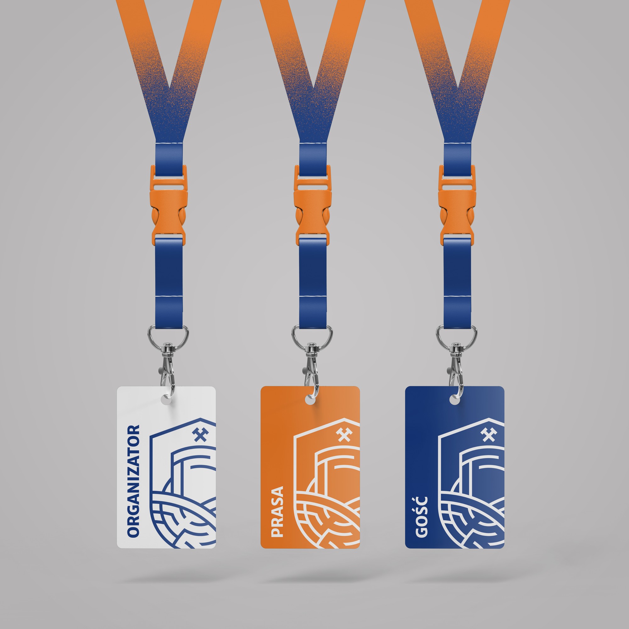
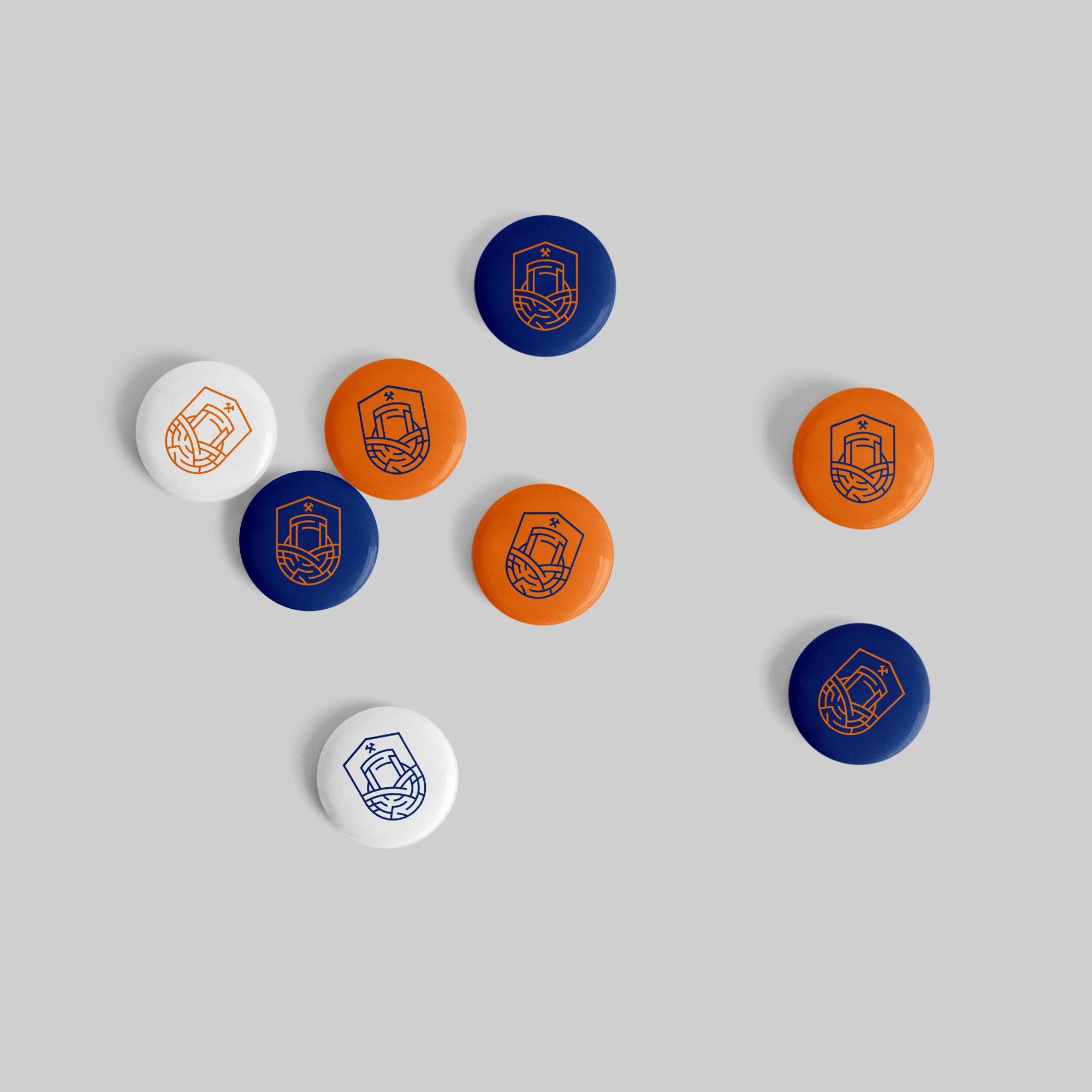
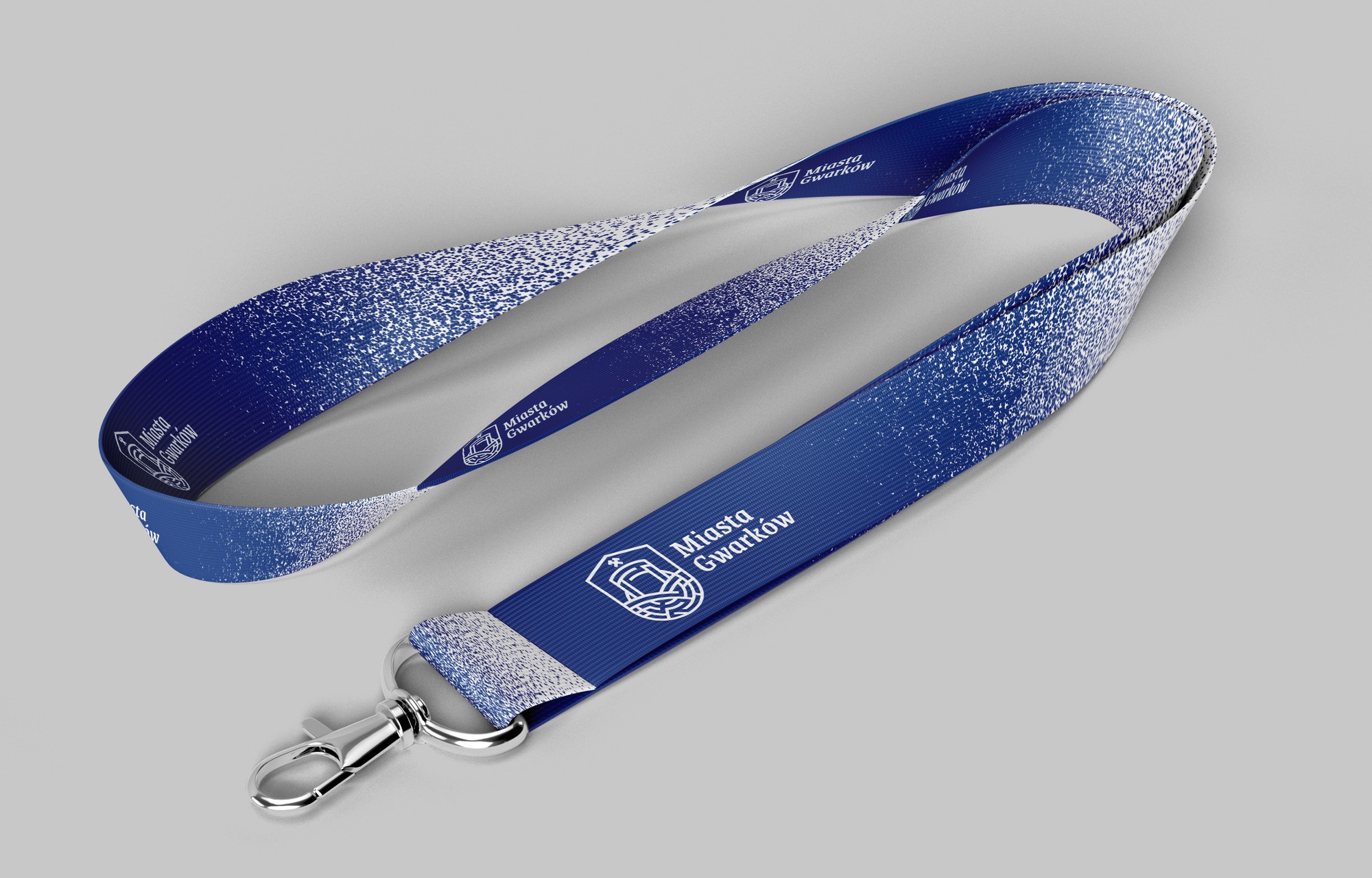
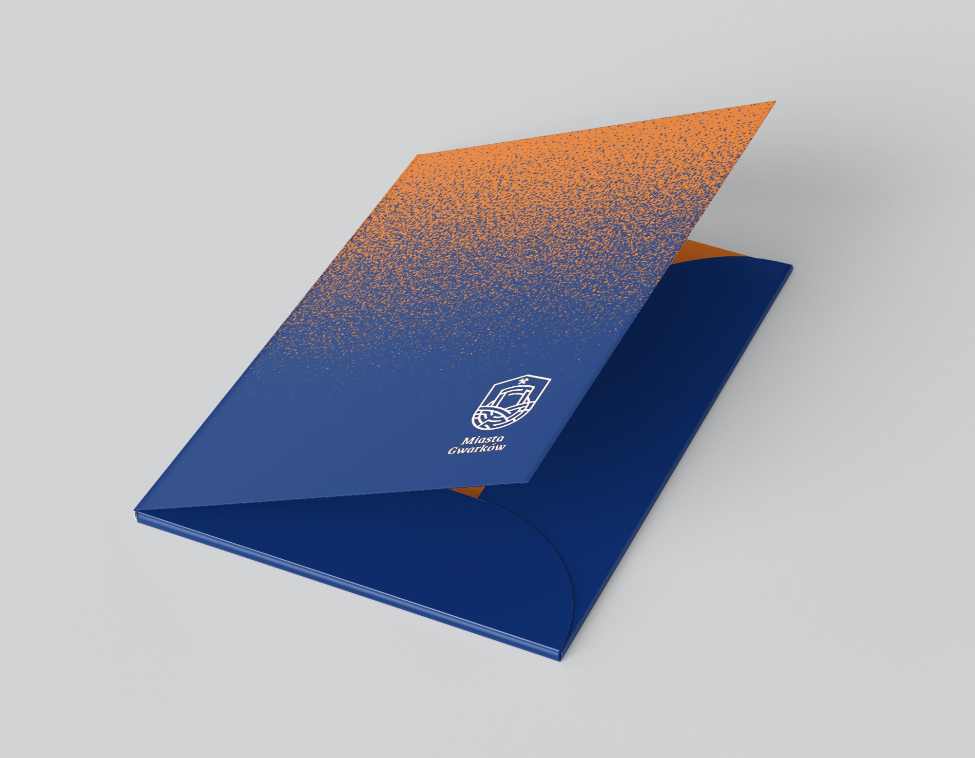
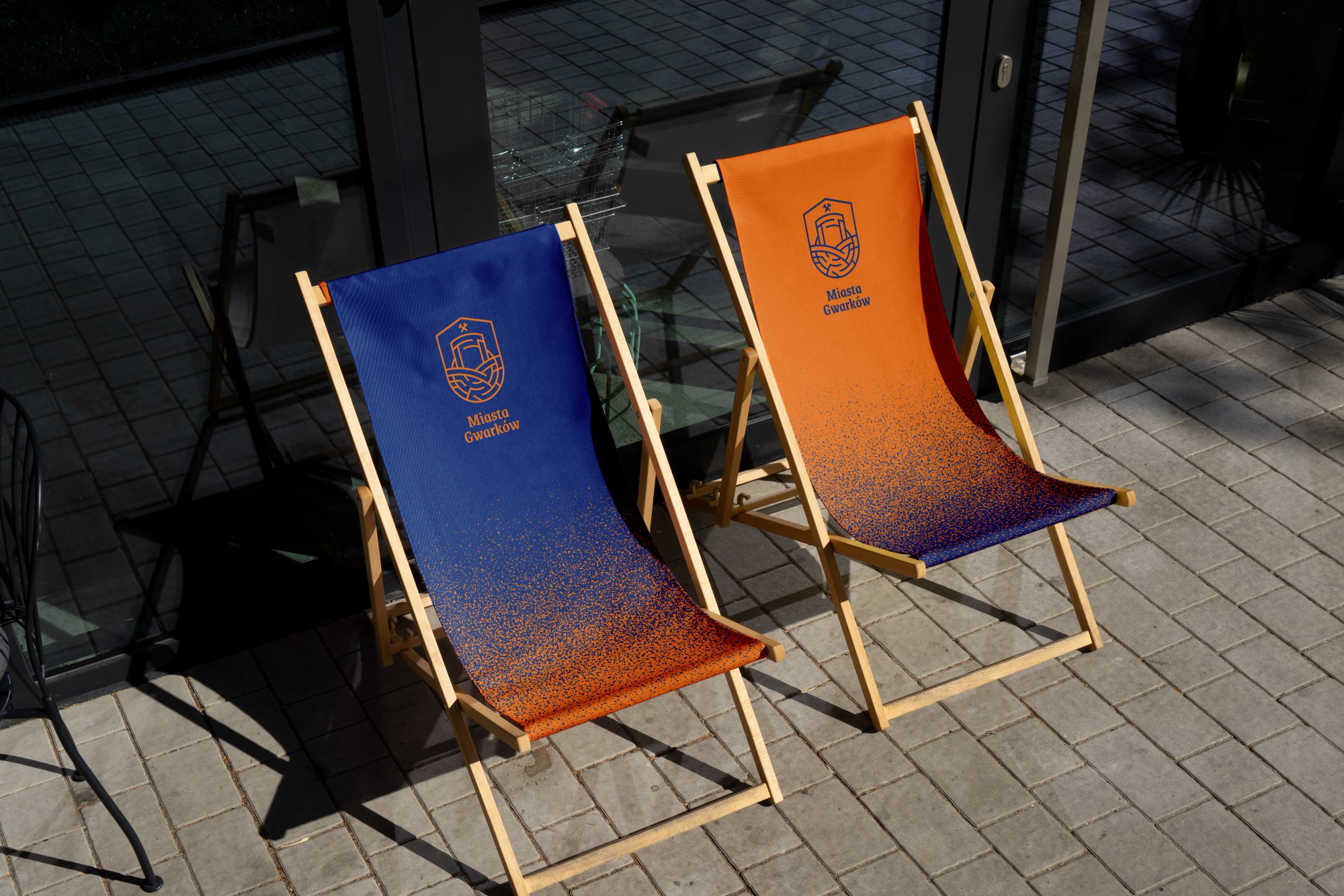
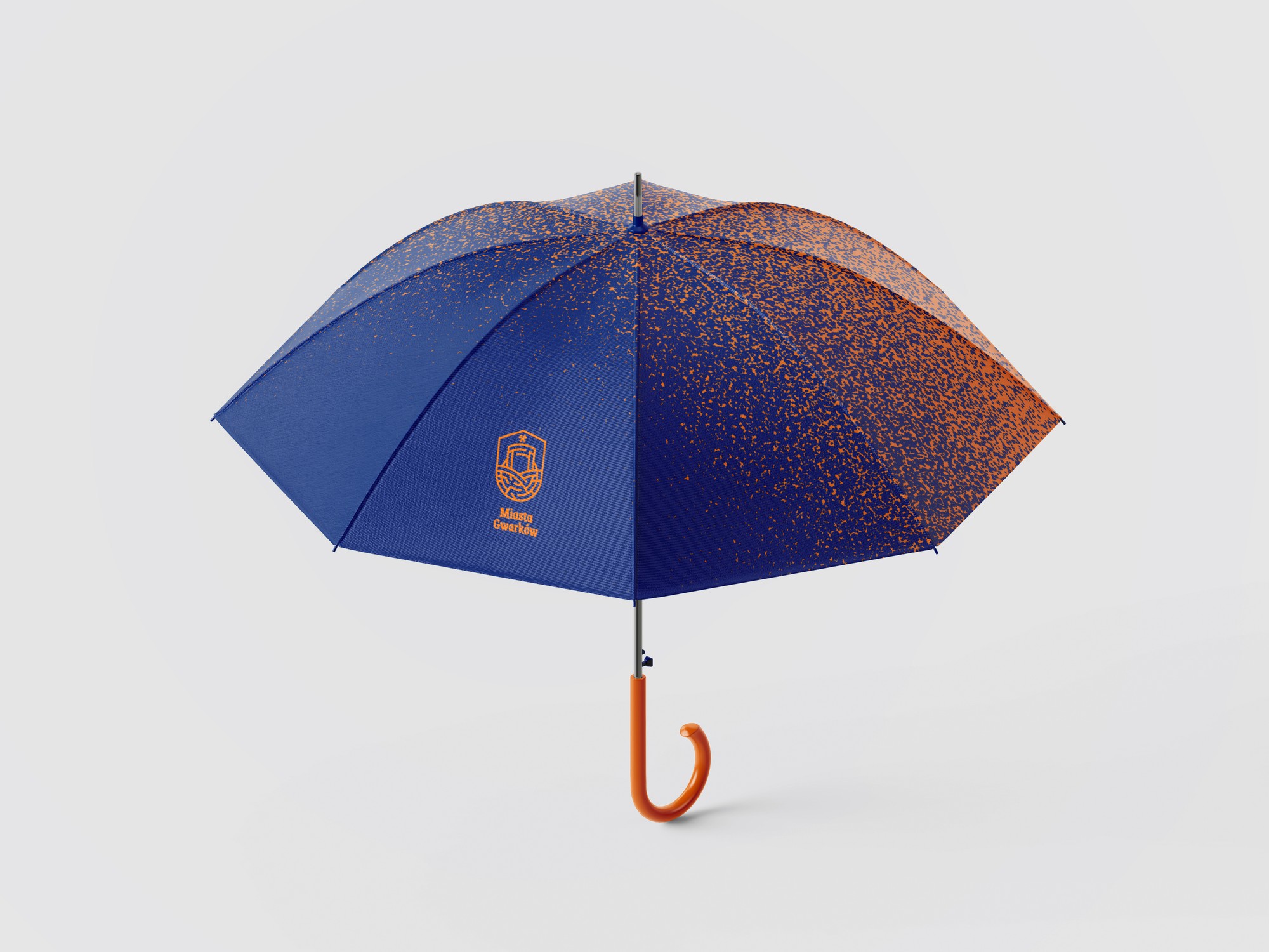
The identity scales down to objects: business cards, letterhead, a folder, a tote bag, lanyards with badges for organisers, press and guests, then mugs, pins, deckchairs and umbrellas. Everything is built from the same blocks, the emblem, the gradient and the pictograms, so each new item comes together without reopening the debate about how the brand looks.
Out in the field
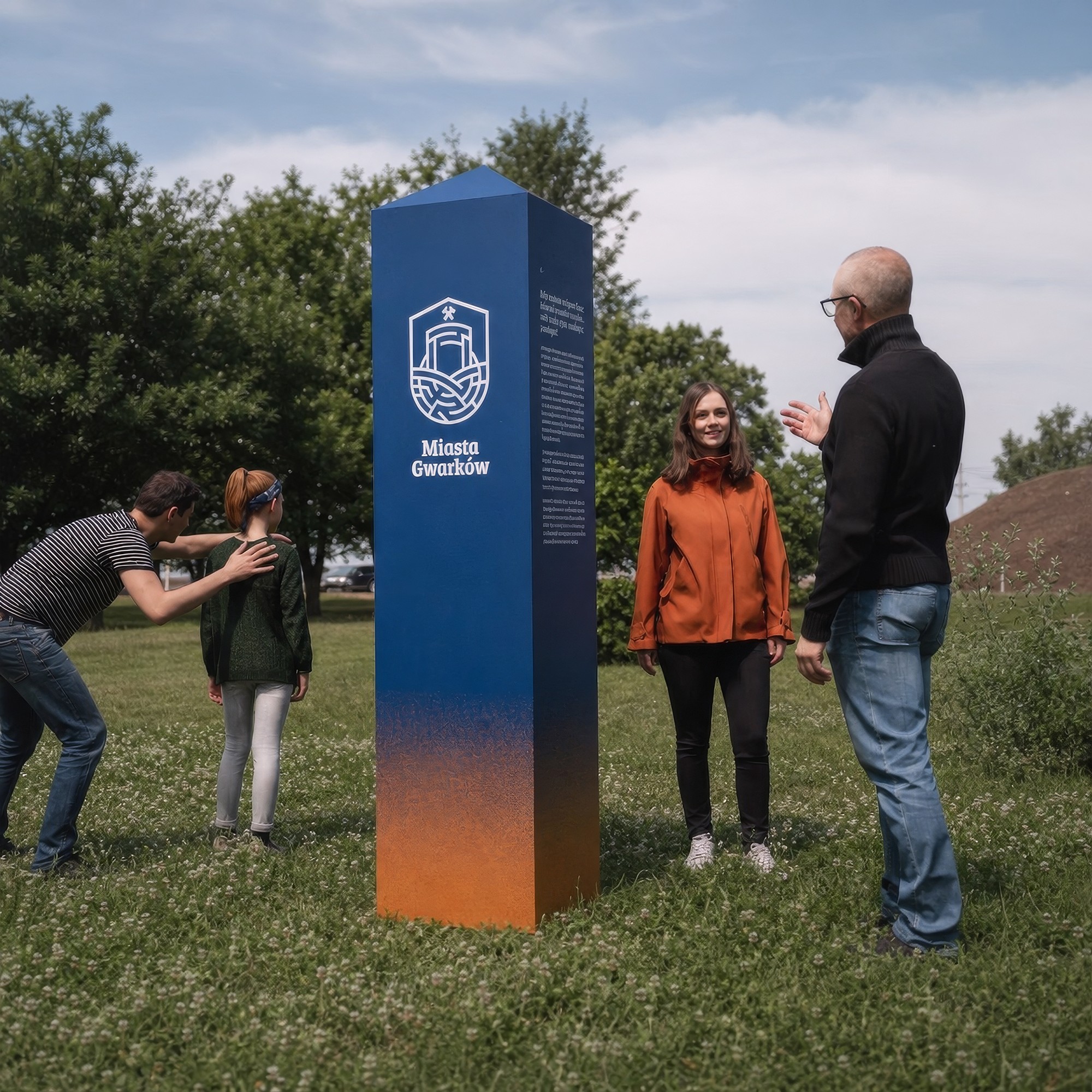
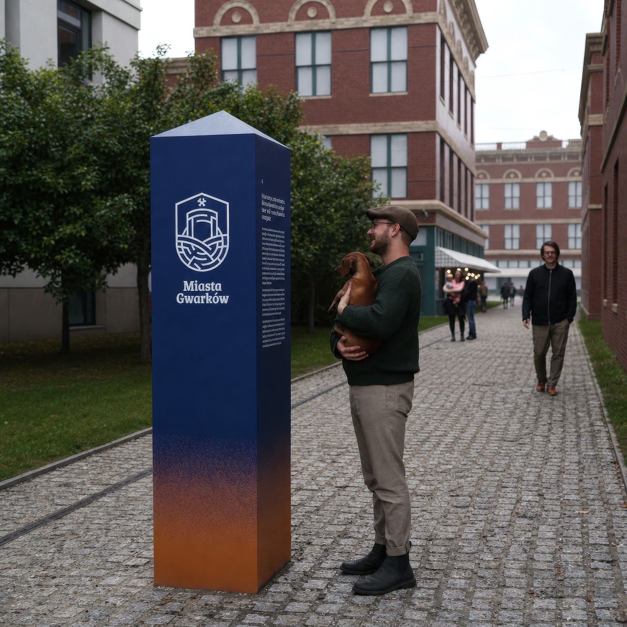
The most recognisable carrier is the 217 cm information post, its proportions echoing the markers of historic mining fields. The same object works on a meadow by a spoil heap and on the cobbles between brick tenements.
The outcome
The Local Tourism Organisation received a complete system, not just a logo: a mark in four variants, three typefaces on a free licence, a colour palette, four graphic elements, photography guidelines with a theme matrix, layout grids and designs for over a dozen carriers, from a business card to the field post. A 94-page brand book documents it all, with production-ready file packages.
Today one person in the organisation grows the brand on her own, and every next contractor, from the print house to the future website team, plugs into the system without guesswork. The identity speaks with one voice on a post by the mine, in a brochure and on a phone screen.
By the numbers
- 3
- towns on one trail
- 4
- variants of the mark
- 94
- brand book pages
- €0
- in font licence fees (OFL)
Related services
Related projects
Culture & tourism
Historic Silver Mine – a website with online ticket sales
Information architecture and user flows, desktop and mobile UI design, website build and a deep integration with the external iKSORIS ticketing system.
Culture & tourism
Coal Mining Museum in Zabrze – 7 years of building a brand from the inside
A different kind of story. Before Sweet Lava existed, Jerzy spent seven years building the brands of the Guido Mine, the Queen Louise Adit and the museum itself from the inside. Three identities, hundreds of print pieces, photo sessions and 7 advertising campaigns.
Blog
Related articles
Branding & typography
Brand manual examples from real projects – and what to look for in them
Three brand manual examples from our own projects, from a cultural institution to an orchestra. What a good manual contains, how to read other brands' PDFs and how to spot a document that actually works.
Branding & typography
Brand manual – what it is, what it contains and what it costs
A brand manual is the instruction manual for your logo – mark versions, clear space, colours, typography, examples of incorrect use. We explain what it should contain, how it differs from a brand book and what it costs.
Branding & typography
Typography in digital design – how typeface choice shapes brand and conversion
Typography is 90% of web design – almost everything a user sees is text. On how typefaces build brand character, readability and sales results.
Branding & typography
A company's visual identity step by step – from logo to design system
How a professional visual identity is made. The process stages, what a good brand book contains, examples from real projects, prices and the moment it's worth growing the identity into a design system.
Related terms
A new brand identity ahead, or a clean-up of the current one?
We design marks, brand books and design systems, and deliver the guidelines in a format AI tools understand. Scope and quote within a few days.
Prefer to reach out directly? hello@sweetlava.eu · +48 507710227